 Home
Home

 Artists
 Search
 Recent
 Random
 Posts
Posts
 DMs
DMs
 Tags
Tags
 Random
 Importer
 Import
 FAQ
FAQ
 Account
 Register
 Favorites
 Login
Login

Shattered Coast, Adept (Patreon)
Downloads
Content
Hello, Adepts! This week's map is the Shattered Coast (40x50), my biggest map yet! This one features series of small islands separated by water, with a tiered island standing at the top of the image. I imagine that that tiered one will probably be a neat place to station a scary enemy with ranged attacks or perhaps the final goal of the encounter, perhaps a statue holding a magic orb or a rare plant which must be collected.
And to help you tailor your encounter to your needs, your alternate version of this map is Murky! It's nice to have more evil-feeling versions of maps, it contrasts my regular Day versions nicely and gives you more room to play with. In this one the water has been recolored to look much less inviting, maybe it's even dangerous to touch? At the very least it looks like particularly nasty critters could be beneath the surface, ones with no eyes, wrinkly skin, and unwashed teeth.

1. For this map I wanted to make something that featured islands and water but didn't feel tropical. Achieving that mostly comes into play at the end with the coloring, but I still tried to design the layout to feel less beachy. That mostly boiled down to adding minimal amounts of sand, but I think that including lots of trees around the edges of the map also helps set the tone I'm looking for, or at least giving the impression that the area is more forested than beachy. Or maybe I'm just imagining that, who can say?
Beyond that, I wanted to try and make use of as much of the map as possible. I haven't made a map this big before so I wanted to make sure I was using the space efficiently, or else I might as well have made a small map and padded it out with filler (trees/open water).

2. After the initial sketch I spent some time drawing up the rocky walls before I stopped and started rethinking the layout, feeling that the placement of the islands felt too even and unnatural. Then I spent an hour deleting, moving, rotating islands one at a time until I felt that I went too far and started over. The final attempt just moved an island a little, added a stream to the bottom, and deleted a bit, just enough to add a touch of randomness.
I also tried a little something different with the water lines, making them less smooth than usual. It's a minor thing but it looks a bit more choppy, which felt right for this map.
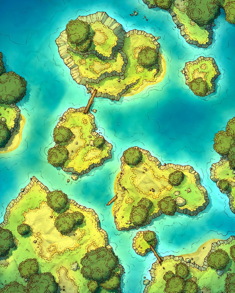
3. Colors. I never know with these kinds of maps. The contrast between water and grass can be such a swing and a miss, it has to be the #1 thing I agonize over when coloring. So much so that halfway through that last sentence I opened up the PSD, completely redid the lighting for each version of the map, and re-exported/repackaged all the files. I do think I'm happy with the final result here, it's nice and colorful with consistent lighting throughout. It's a shame I'll probably be unhappy with it again in 2 hours.
This version I've ended up with is somewhat flattened, with less bold shadows, minor highlights, and significantly less vibrantly blue water than I usually would implement. No, seriously, the water was way more blue when I started this blog post, imagine that. I swear, the only way I could ever make a perfect map would be if I made 1 a month, spending 4 days sketching and making outlines and then the rest of the month I'd color and recolor the map over and over again, slowly spiraling into madness.
Files
