 Home
Home

 Artists
 Search
 Recent
 Random
 Posts
Posts
 DMs
DMs
 Tags
Tags
 Random
 Importer
 Import
 FAQ
FAQ
 Account
 Register
 Favorites
 Login
Login

Grimy Inn, Adept (Patreon)
Downloads
Content
Hi Adepts! This week I made the Grimy Inn (18x16), a terrible place to stay the night! I don't like the look of those beds, and the green stuff growing in the corner just winked at me, but at least the company here is great, right?
Your alternate version this time is a Sunset recoloring/relighting, as per a request made by a patron a few months ago for a version that would fit well in a Western setting. I think it will fit quite nicely and might even be considered a pretty decent place to stay the night in that setting, but that's up to you!

1. I always have a tricky time laying out buildings, and even when I end up with a sketch I'm happy with I usually end up making major changes when I get to placing rooms and arranging props. This time I started with a much more cramped tavern space with some side rooms for smokey poker games and supplies, but once I started filling the room with tables I kinda hated how little room there was for maneuvering and seating, and I also hated how the fireplace didn't open into the tavern. So, I moved the smokey poker room to the second floor and cut the 'presidential suite' in half, which I felt was appropriate for such a shitty inn.
While I was at it I also reduced the number of rooms on the second floor so I could add a little roof space, which I felt would be fun for sneaky reconnaissance missions where a rogue can listen in on illicit conversations in the two larger rooms. Someone has to look out for our rogues, and it might as well be me.

2. I actually had some fun drawing this map, which is a little unusual for buildings considering how dang boring they are compared to a spooky forest or some desert ruins. Maybe that's because yucky inns are more interesting than the usual fairy tale adventure inn and allow for more eye-catching grimy details? Either way, half of the fun was adding rips, tears, stains, and breaks to all the props- really roughing the place up.
Something I wanted to try this time was adding a little bit of environment around the first floor, a detail I've appreciated in many of Mike Schley's maps. While this limits the map's usefulness a little bit, since it establishes that the building is located on a cobblestone street and not on a dirt road, I like how it sets up maneuvering around the building. Overall, a nice touch, but I don't doubt that some of you won't much like it.
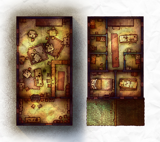
3. As I was expecting, most of the griminess of this map came from the coloring and shading, not the outlines. I initially started with my typical colors for a wooden-floored building, but I quickly found that it felt way too cheerful and clean. To fix this I had to do a little experimenting to find what colors get across the yucky vibes I wanted to nail down.
The biggest change was the floor color, which is much more pale than usual and gets across a kinda neglected and unkempt feeling when shaded with some splotches of brown and green. I used that as the basis for the rest of the colors, working upwards while attempting to match the feeling without getting too washed out. I might have gone a little too far in a few places, especially with the greenish shadows, but I think overall it looks pretty damn grimy.
Files
