Home
Home

 Artists
 Search
 Recent
 Random
 Posts
Posts
 DMs
DMs
 Tags
Tags
 Random
 Importer
 Import
 FAQ
FAQ
 Account
 Register
 Favorites
 Login
Login

Skull Island, Adept (Patreon)
Downloads
Content
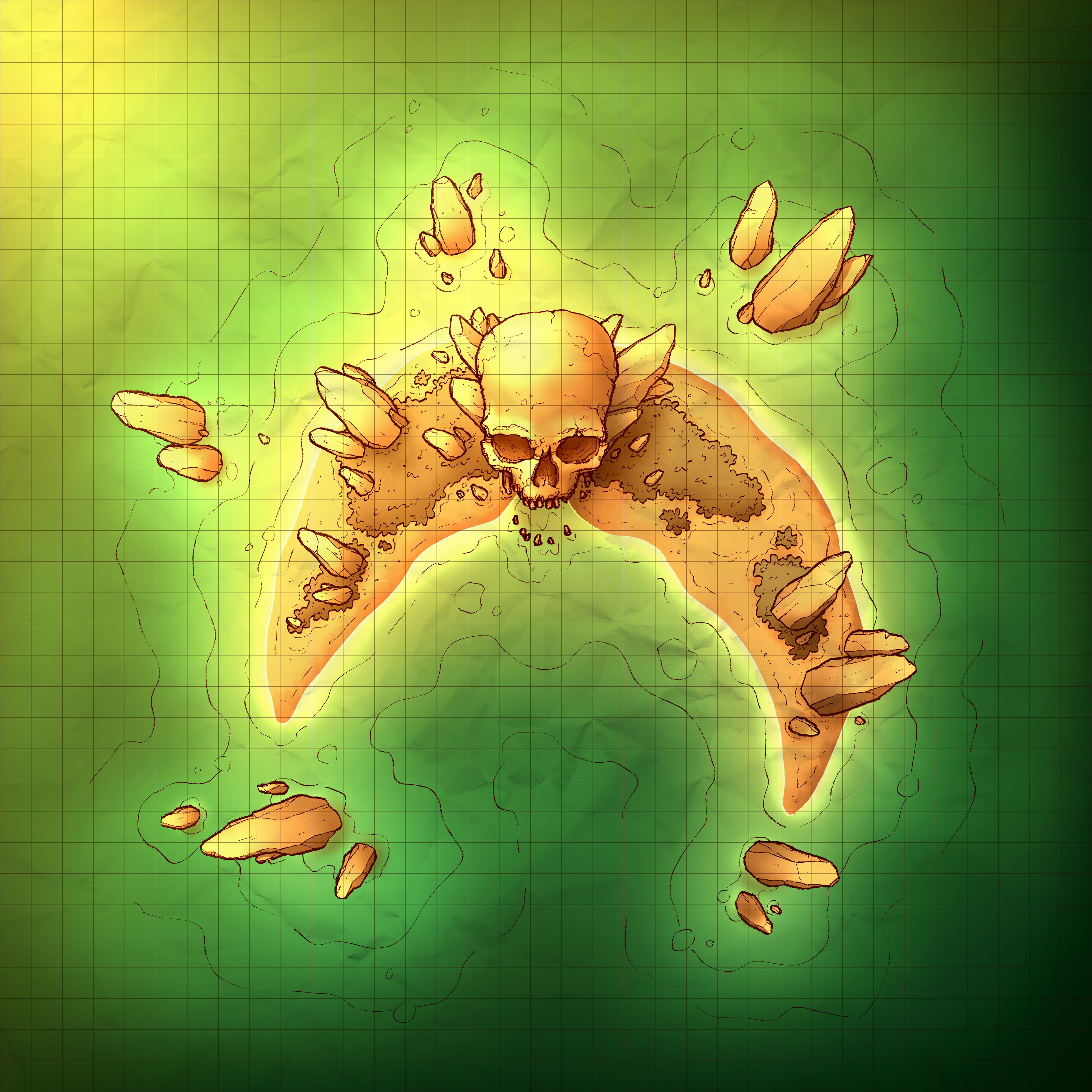
Hey look, a Halloween map! Is it subtle? No! Is the concept easy to integrate into the average campaign? Not particularly! Does it look cool? Yeah! It's the Skull Island (35x35), a little strip of land with a preposterously large skull sitting in the middle. Why? I don't know, but I think it's fun!
Your alternate version of it features sunset lighting, with a tropical twist! It's pretty eyecatching and feels very dramatic, and the colors are a lot of fun too. I like it!

1. I started this week off by getting my covid booster and, for the next few days, experiencing just about every possible side effect of it: exhaustion, nausea, chills, fever, aches. I was stuck in bed, so I finally caught up on reading One Piece, which gave me the idea of a spooky island with a big skull on it! Not super big, because after I recovered I was left with 2 fewer days to make the map, but menacingly big certainly. Maybe someday in the future I'll see about making a huge skull map with floors inside, but for now you'll have to be happy with a 1 bedroom skull with an ocean view.
And yeah, that's just about all I've got for the design of this map. I thought it would be cool if the sand made a crescent shape, and some jagged rocks would be dramatic too, so I did that. Sometimes that's just how the process goes!

2. I started off with the skull, using a 3D model of one from Sketchfab as reference, angling it correctly so I could get the angles right. Once the shapes were in place I added all those gnarly little details that make it feel old, worn, and dirty.
The rocks took a little longer than expected to draw, mostly because I don't often draw rocks that are supposed to be so strangely angled and vertical. I scoped out some maps by other mapmakers I follow, to see if they've done something like this before and how they handled it. Caeora's island maps particularly were a huge help, and I used one of her maps as inspiration as I worked.

3. And colors! I decided that I didn't want to color this like my usual tropical map, but rather I would aim to do something more similar to one of my foggy or spectral variations, just more crisp and readable. The end result is definitely more bright than I was originally intending, but I no longer risk my maps being too dark when viewed on screens other than mine (which is apparently brighter than average, I've discovered).
I also ended up being a little more easy-going with my shadows, opting to be a little softer than usual. I emphasized gradients rather than hard-edged shadows, which I think makes the raised props pop a little more than usual! Specifically the tips of the rocks and the protruding parts of the skull look very nice, so no complaints here, but I'm going to have to think about how effective this shading is. Either way, I'll definitely consider using this style again in the future if the right map comes around.
Files