Home
Home

 Artists
 Search
 Recent
 Random
 Posts
Posts
 DMs
DMs
 Tags
Tags
 Random
 Importer
 Import
 FAQ
FAQ
 Account
 Register
 Favorites
 Login
Login

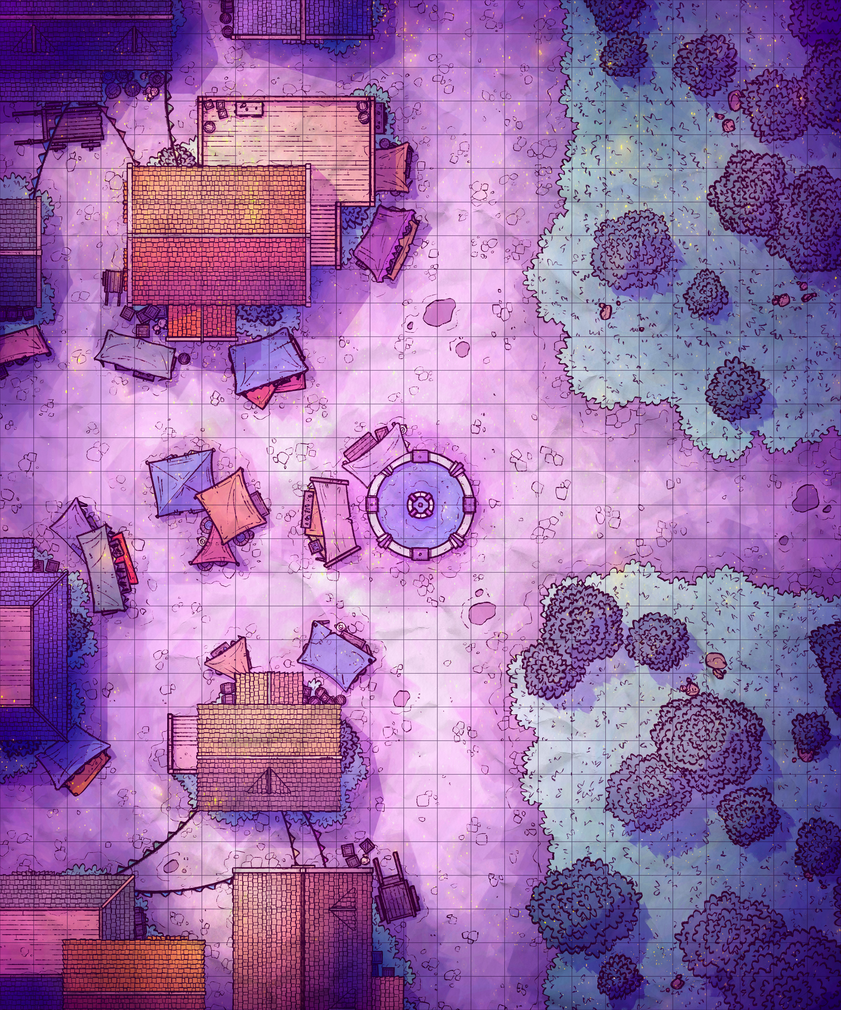
Parkside Market, Adept (Patreon)
Downloads
Content
This week I made the Parkside Market (25x30), my next city map! I've been making these urban maps for a few weeks now and I think I'll make a handful more, no more than 3 maybe. In the meantime, I'm going to see if I can make some more seasonally Halloween-y maps! I have a couple small ideas to develop, like maybe a city's graveyard or crypt, or maybe a spooky butcher's shop with lots of bloody details. I'm keeping an eye out for your suggestions though, so let me know what you think.
Your extra version of this week's map is a Fey recoloring and reshading- featuring a more mystical and magical vibe than the regular one, as well as moodier lighting. I imagine this one would be nice as a different kind of sunset map as well, with the fireflies and mood lighting setting a somewhat more romantic tone than my usual orange/yellow sunset maps! Give it a try!

1. So, my starting concept for this map was simply a 50/50 split between forest and city. I liked the thought of a fountain and an intersection being the centerpoint here, but when I drew it out I decided that I liked the thought of the streets being nice and wide with plenty of room for carts to travel through (hypothetically). When that was all sketched out I felt that, while it made sense for there to be so much open space for through-traffic, it was a little boring. All that open space detracted from the bustling city vibe I wanted to build on, and while courtyards and other open urban areas have their place in combat I felt that I could cut the difference here and fill up a fair amount of the street while keeping plenty of long sight-lines elsewhere.

2. Look, new roofs! Yes, that's right, these are entirely new roofs, I spent a looong time whipping up a new tiled-roof texture and assembling a whole new array of rooftops. This new roof texture is an improvement in a couple ways: the lines are more regular, featuring fewer large fluctuations in line size; I made sure to avoid adding details that betray the tiling of the texture (no broken tiles or grime); the lines are a fair bit thinner, reflecting how I don't want them to be very eye-catching.
And, this is the first time I've textured a large area with the new cobblestone design! This new version, with simple scattered patches of cobblestone, is waaaay less detailed, cutting down on the noise of the map massively. In fact, it's so low on detail that puddles and other grimy details actually stand out a little. The downside of all this is that I have to draw these cobblestone outlines every time, as opposed to dropping in the full, massive cobblestone texture I had been using previously. So, a bit of a time loss here, but it's an improvement so I won't be looking back.

3. Colors! This time I actually went and looked back at my very first urban map, the Town Courtyard. While there's so much I don't much like about it, the lighting among them, there is something satisfying about the subtle lighting. Actually, looking at it now, there's a lot of mistakes that I made when lighting that map- a ton of the shadows don't make much sense.
Anyway, I wanted to make a little attempt at imitating that lighting, though obviously with several big changes. Mostly, I wanted to replicate the simplicity of it, which mostly came through with subtle changes in highlights and soft shadows. I'm not sure if I quite got there, but my wife said it looks cute so I've got that going for me.
Files