Home
Home

 Artists
 Search
 Recent
 Random
 Posts
Posts
 DMs
DMs
 Tags
Tags
 Random
 Importer
 Import
 FAQ
FAQ
 Account
 Register
 Favorites
 Login
Login

Shipwreck, Adept (Patreon)
Downloads
Content
I'm back again with a new map, the Shipwreck (25x20)- a rare map with a single word name. I tried out several other titles, but at the end of the day it's really a very standard map and it seemed unnecessary to overcomplicate things.
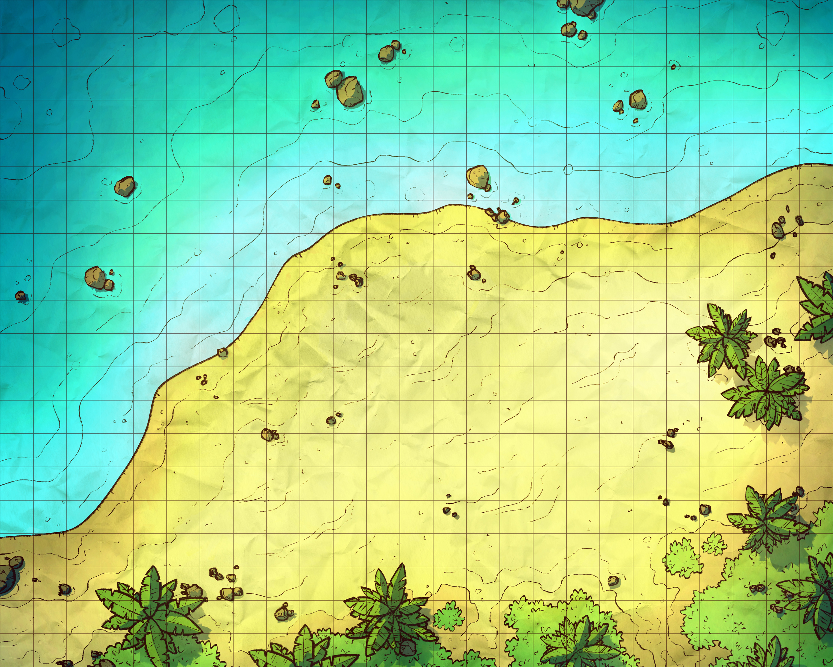
Your alternate version this time is a good one, a version of the map without the shipwreck which I'm calling 'Beach'. How handy is that? This is just about as simple as it gets, so much so that I can imagine it'll be almost twice as useful as the actual Shipwreck version. And, of course, I've made a night version of it as well, for romantic strolls down the beach at night that turn into holding out romantically against Sahuagin raiders.

1. Yup, not my most detailed beginning sketch. I had originally started with a much larger frame, including a pretty huge amount of grass, trees, and shoreline, but I felt I was losing the plot so I zoomed in a fair amount.
Also, it's worth noting how extremely low detail the ship is at this point. I decided that it was not worth the effort to sketch out the specifics of wreck so early since I wasn't exactly sure yet the angle or amount of wreckage I wanted to scatter around the shore. On top of that, it's not always useful to go too hard on an early sketch like this- I like to use this step as just a way to block out props and explore ideas.
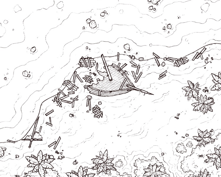
2. Moving on to the outlines, I started off with the boat- everything else would find its place pretty quickly afterwards. I decided to stick with just a big chunk of the front (which is probably the most recognizable part of a ship), as well as some of the 'ribs' leading up to the water, which will offer some cover as well as give a little shape to what the rest of the boat presumably looked like.
To help get the angles on the boat to look realistic (if not reasonable) I went Sketchfab and looked up pirate ship models, positioning them at the angle I wanted and using them as reference. I highly recommend doing something like this if painting or drawing anything with complicated angles such as boats.
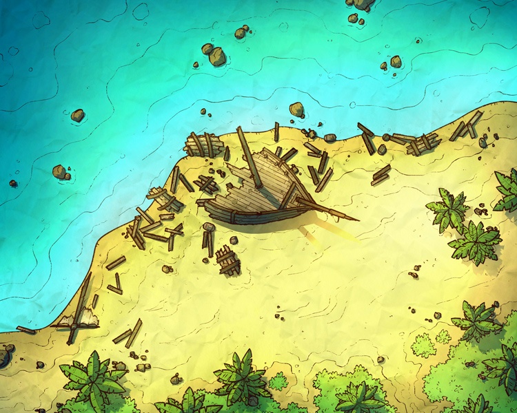
3. As I like to do, I started coloring by finding a previous map with a similar theme or environment and color picking directly from it. This helps similar maps look and feel like they could be part of the same world and keeps my archive feeling uniform. Or at least it would if I would stop changing my colors and lighting every couple of months.
I decided to go a little more vibrant than my last beach map, the Island Hut, whose colors didn't feel quite right here, at least for the image I had had in mind. I think the biggest changes were the grass and water, which somehow felt extremely dull here. I ended up having to hut for more appropriate shades of both, leaning more toward emerald greens and a vibrant gradient of cyan which felt pretty nice.
Overall, a very simple map, but the details were more complicated than I was expecting!
Files