Home
Home

 Artists
 Search
 Recent
 Random
 Posts
Posts
 DMs
DMs
 Tags
Tags
 Random
 Importer
 Import
 FAQ
FAQ
 Account
 Register
 Favorites
 Login
Login

Roadside Watchtower, Adept (Patreon)
Downloads
Content
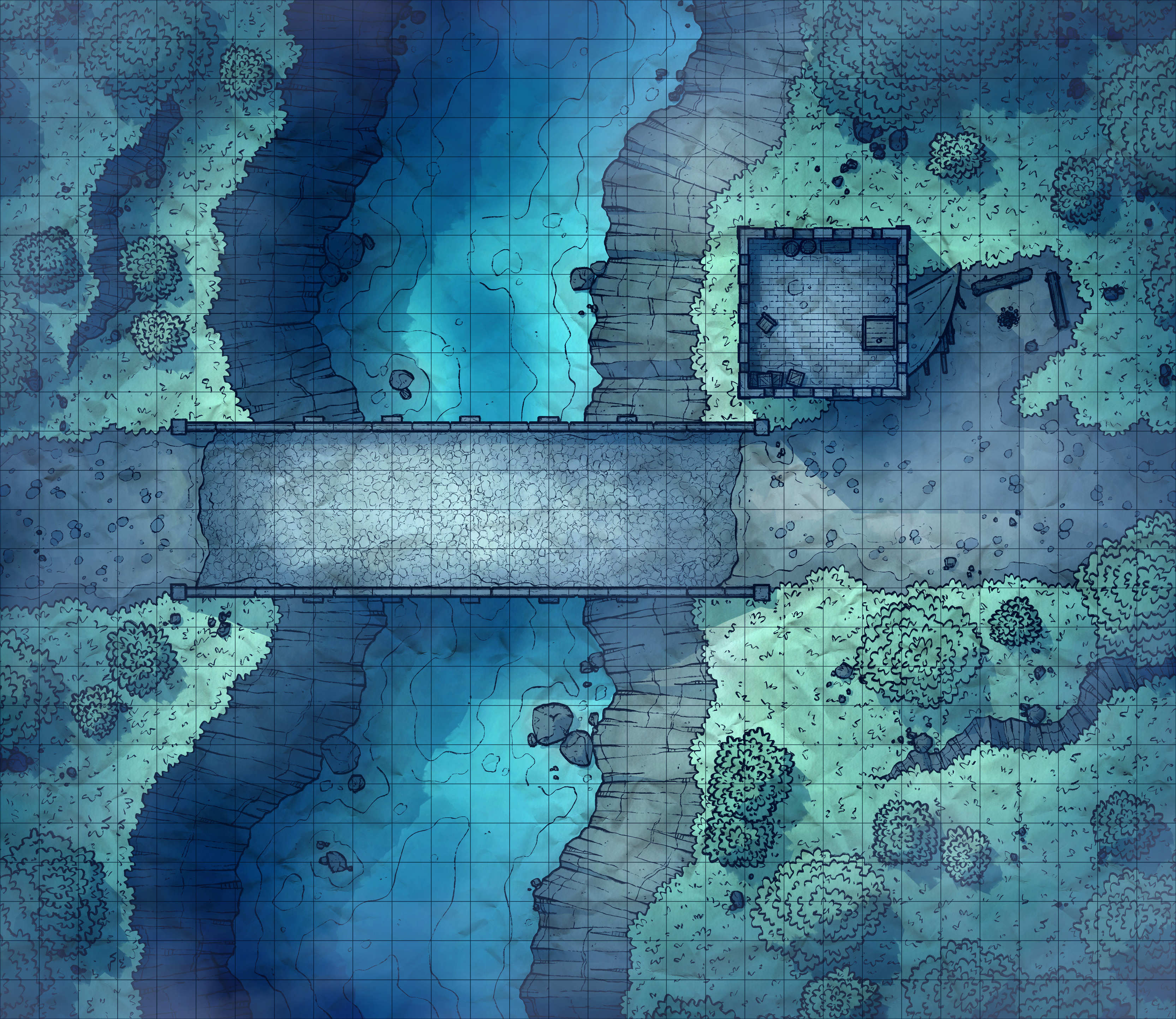
Hello Adepts! This week's map is the Roadside Watchtower (30x26), a simple map with a somewhat complicated design. Maps with both interiors and exteriors are always tricky to lay out and shade, and since this one has 4 floors it's a little more difficult than usual. We'll get into that in a second.
Your alternate version for this map is a dramatic Foggy recoloring! I liked the thought of a shadowy redo of the day version with a more spooky vibe, one where I imagined the guards at the tower peering out into the fog and seeing the silhouettes of terrible monsters approach. I think this is my favorite version of this map, honestly, just for the dramatic setting and how that should set this map for some fun encounters.

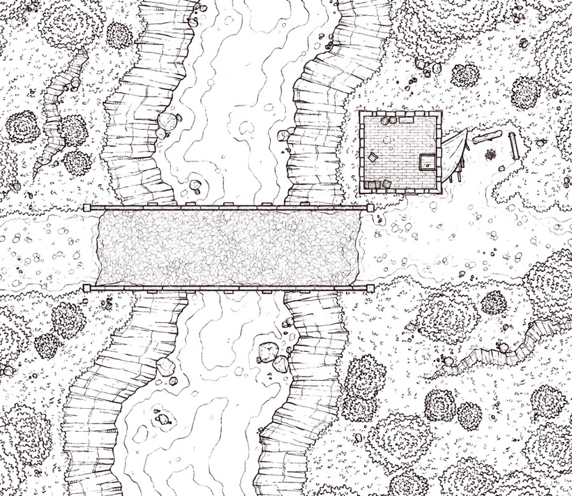
1. Most of this map is simple enough, a hardy bridge crossing a river in the forest, the watchtower turned out to be a bit of a puzzle. I didn't want it to feel out of place next to the bridge, so I decided to go with a similarly hardy tower with 4 levels. I liked the thought of it being slender tower with not too large of a footprint, so only enough room inside for a few props per level alongside a spiraling staircase, which felt to me like the little watchtowers in Skyrim. After this first sketch, I later scaled down the tower even further, going down to 4 grid squares, since I felt that there was a bit too much open space in there originally.
2. I remember a time where I reused old patches of rock walls. These days it seems like I'm dead set on designing maps with unique shapes of walls that I've never made before, so not even crafty cutting and pasting would save me time. It turns out that was the least of my issues though, since of course I had to then design 4 floors of a little tower. I don't know why layout out interiors feels like pulling teeth, but it just grates on me. This is partially why this map is coming out half a week late, though mostly the delay is because I started playing Hades and it has become a presence that looms over my life.

3. Here's where I get to the beginning of my troubles. I wanted to set up my layers so that I could easily line up the stairs and keep the structure of the tower in mind, while also being able to quickly export everything to PNGs later. Unfortunately, the way I layer color effects and lighting on top of the map doesn't work terribly well with having several floors and this ended up making my life difficult. Only for a minute though, just long enough for me to stop being a dummy and think things through.
I used two of my recent forest maps for guidance when coloring/shading this one- Rocky Forest and Twisted Shrine. I liked parts of both but disliked certain aspects which I thought I could skim off, and I partially succeeded.
Files