Rocky Forest, Adept (Patreon)
Downloads
Content
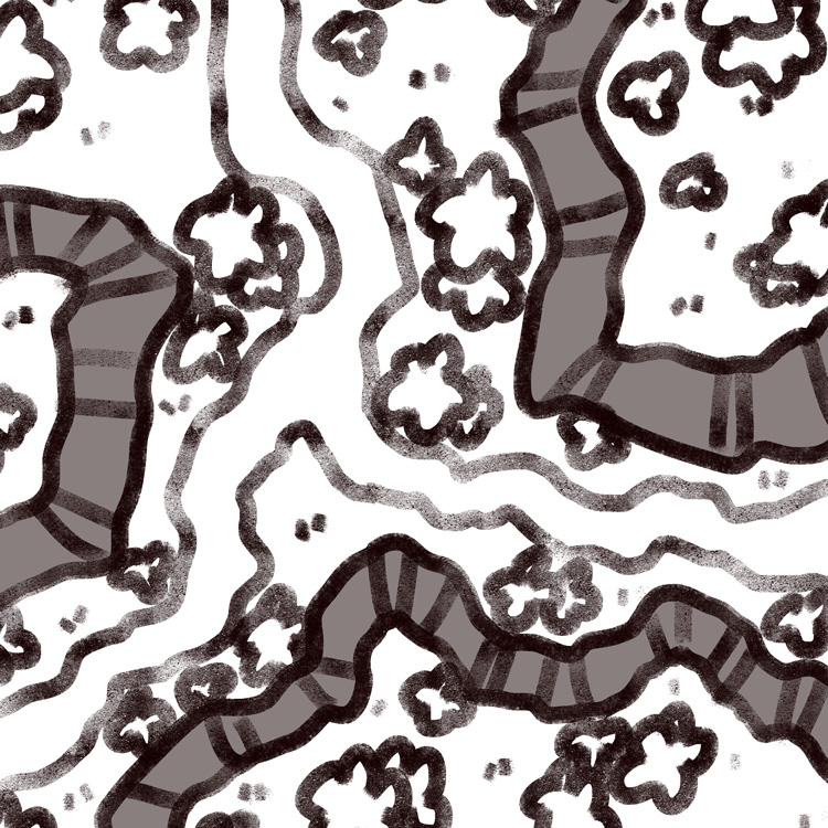
Hi Adepts! This week's map is the Rocky Forest (25x25), a nice and simple map with lots of changes in elevation which should make encounters a little more spicy, especially if your players can come up with interesting ways to ascend the rock walls quickly or if they're fighting flying foes.
Your alternate version this time is one where I swapped out the grassy forest ground below the rock walls with a nice stretch of beach! I liked the thought of changing the terrain drastically for this version with water and sand, perhaps making the map useful for encounters in hidden coves or secluded tropical beaches.

1. Since I knew I was going to be a little short on time this week since I wanted to reach my goal of 4 maps before the month ended, I decided to put aside my more complicated maps for a little while and instead make something that I have a bit more experience with. My wife suggested a patch of a frozen lake, with cracks on the ice and pieces floating off, but I felt that would feel like a cop-out due to how blank and mostly empty it would be.
I thought maybe that it had been some time since I made a nice and versatile forest map without much story baked in, and someone had recently requested more maps with lots of changes in elevation, so I felt that this sketch would make for a satisfying and realistic design for the week. Eventually I decided that the forking path along the rock walls was getting in the way of all the trees I wanted to add and perhaps wasn't adding anything too important to the design, so I cut it early on and replaced it with a few patches of dirt (for color).

2. One of my major concerned for multi-level maps is that it won't be clear which areas are higher than others. Early on in my mapmaking I made several maps which utterly failed to express changes in elevation, and from that I learned a thing or two about setting up both the design and outlines so that the viewer has clues that express this information, so that even if the shading doesn't tell you everything you need to know then a second glance will clear any confusion up.
Mostly, I like to let the grass hang over the higher edge of a rock wall, while on the ground only a few patches of grass will break the lower outline so as to give some texture. Similarly, I place rocks near the bottom of the rock walls so that they slightly overlap them, while I never place them at the edge of the grass at the top, where they might tumble down the ledge to the bottom. These are probably common sense decisions, but I feel like they're important to keep in mind when drawing outlines and might be worth discussing for anyone interested in making their own maps.

3. I thought that maybe it was time I take a look at the palettes I've used across all of my forest maps and try to judge if I need to take any steps backwards towards previous iterations. Recently, I've felt that many of my newer forest maps look a little too high-contrast, with excessively vibrant greens that are a bit overwhelming. I decided to go back to one of my earlier forests for inspiration, the Forest Clearing, which had relatively subtle lighting and colors which made it pretty popular. I decided to go a little heavier on the lighting and shadows, but I tried to imitate the tone of the Clearing with a mix of the more dynamic lighting I've been working on since.
I think I'm pretty happy with how it came out, but I feel like I usually say that when I finish a forest map. As usual, I'll need a week or two before I can look at it critically with fresh eyes, but I doubt I'll be making another forest map for a little while.

