Home
Home

 Artists
 Search
 Recent
 Random
 Posts
Posts
 DMs
DMs
 Tags
Tags
 Random
 Importer
 Import
 FAQ
FAQ
 Account
 Register
 Favorites
 Login
Login

City Canal, Adept (Patreon)
Downloads
Content
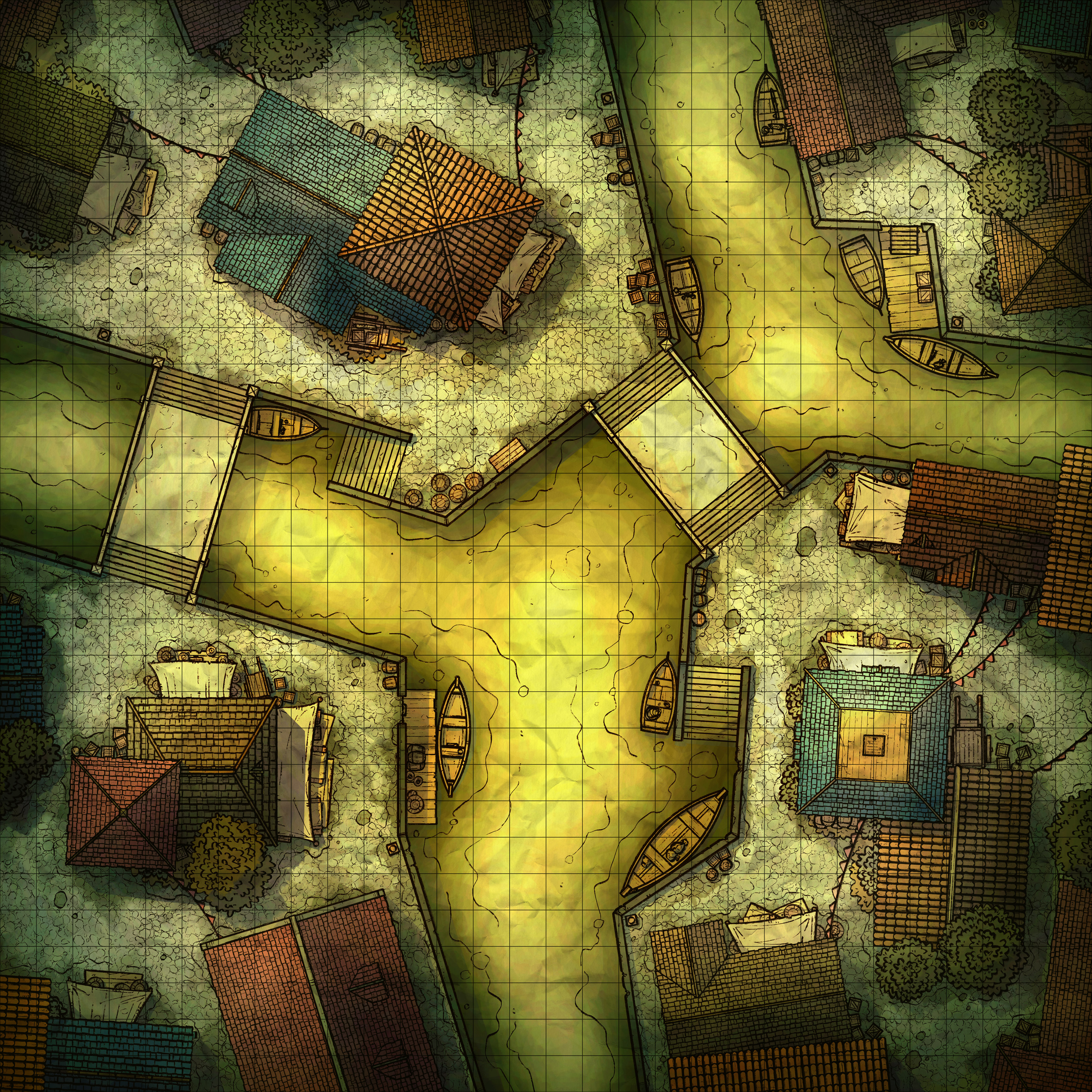
Hello Adepts! This week I made the City Canal (30x30), and your extra version is a nasty Grimy recoloring! The yucky brown water doesn't look nearly as appetizing as the original, perhaps even dealing poison damage to anyone who tries to spend a turn or two in there, which will add a little more danger for anyone who doesn't want to take the main roads.

1. I've been seeing lots of these canal maps around the internet lately, which reminded me that I've never taken a stab at one! I really liked the idea, since I usually feel like city maps are way too mono-tone and in need of some splashes of color.
As always, laying out city streets is almost always difficult, especially when I decide to twist the buildings so they don't snap to the grids. I felt that a simple 'T' intersection canal wouldn't be very interesting though, so for the sake of creating something visually exciting and believable I decided to give everything a random angle. It's a small change, but it really does add some realism to the map since 100% right angles just don't feel right in fantasy settings (for some reason).

2. Wow, I sure am glad I put the time in to making a huge cobblestone texture, it has saved me so much time. Even so, I've been thinking about making an alternate brick texture to give some variety, but I'm worried that the grid will be hidden among all the mostly-straight lines.
Similarly, I now have a pretty huge number of roofs to mix and match, which also is an enormous help. For the sake of all of you, I really ought to clean them up and assemble them into a single clean file, and I think I might try to do that as this month's Revisited post. I don't have a lot of open space for extra buildings in my maps, but I'm sure some of you would make good use of that.

3. I feel like every time I make a city map I redo my coloring from the ground up. This time I tried to keep the vibrant colors from getting washed out from the glare, with middling results, but honestly I think it's better than my previous attempts. Something still doesn't feel quite right though, there's some depth missing somehow and I'm not quite sure why. Maybe I went a little light on the shadows? Well, either way, the coloring feels more tropical for this map, which is appropriate because it features water much more than my usual, so it doesn't feel wrong.
Files