 Home
Home

 Artists
 Search
 Recent
 Random
 Posts
Posts
 DMs
DMs
 Tags
Tags
 Random
 Importer
 Import
 FAQ
FAQ
 Account
 Register
 Favorites
 Login
Login

Modest Chapel, Adept (Patreon)
Downloads
Content
Hello Adepts! This week's map is the Modest Chapel (27x19), a fun place for your players to convert partway through a difficult adventure, or help the resident cleric fight off the zombies which assail him.
Your alternate version this time is a nice Fall one! I haven't had the chance to break out this palette for quite a while and I jumped on the opportunity while I was working on a forest map. Cities with fall colors just aren't nearly as satisfying or attractive as a nice autumnal forest, right?
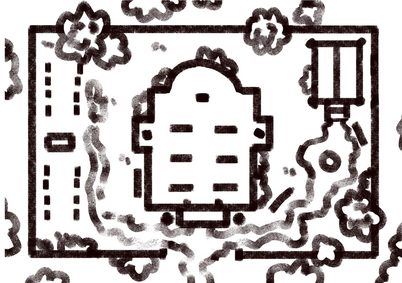
1. I don't know if any of you know the type of tiny chapels that I'm trying to imitate here. I'm thinking about those little Western-styled places you see in the movies sometimes, the ones that are one big room and are great for dramatic standoffs. My proportions are a little different than those, but I liked the thought of a little domed roof on this squat church, I thought it felt a little more fantastical.
Other than the building, I like the tactical aspect of a walled courtyard, I think it makes for creative solutions and helps sneakier folks take advantage of their strengths. The only thing I'm not a big fan of is how boring it looks. I nearly went with a more wiggly wall without wight angles- cut off corners and few straight lines. It definitely would have been more interesting to look at, but who builds this pristine little chapel and then puts a half-assed wall around it? It seemed like it would have been a silly choice.

2. Outlines! For the first time, I tried to reuse some grass outlines for this one! Maybe that's why I've been less reluctant to make buildings recently, I'm getting a little tired of drawing grass? Either way, the grass transplant was semi-successful and definitely slower than just drawing them from scratch, so I'll never do it again. Other than that, this is a pretty standard map- I whipped up the buildings in record time thanks to additional grids I've prepared which break down the 1" squares into 64ths. With the extra guide lines, I can make sure the walls are all equally wide and symmetrical without any eyeballing. This is definitely one of the best upgrades I've made to my process, it's been a huge help over the last few months.

3. Colors! Lighting! As I've mentioned for my last few forest maps, I've been working on improving their colors since I decided that they weren't quite doing it for me anymore. For this attempt, I brought down the trees' saturation and increased the overall contrast of all colors. This palette isn't bad, maybe a little too heavy on the glare and the vignette, but I'm pretty happy with how it turned out. The best part is I didn't have to prepare a second batch of overlays in order to keep the inside lighting from blending into the background too much, it all came together pretty quickly. Not bad, overall, I'll probably use this as my baseline for the next couple iterations.
Files
