Home
Home

 Artists
 Search
 Recent
 Random
 Posts
Posts
 DMs
DMs
 Tags
Tags
 Random
 Importer
 Import
 FAQ
FAQ
 Account
 Register
 Favorites
 Login
Login

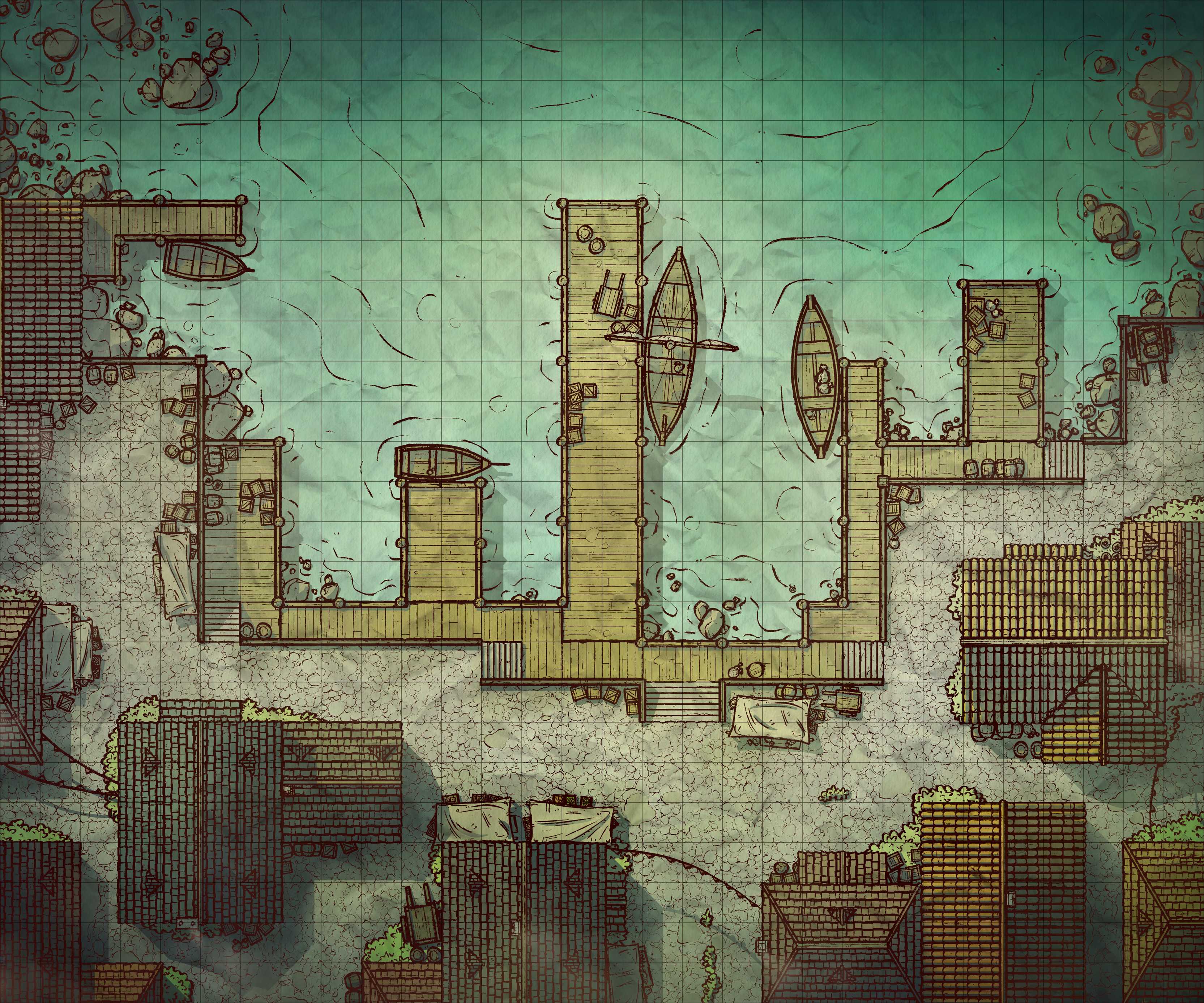
Rocky Harbor, Adept & Expert (Patreon)
Downloads
Content
Hello Adepts/Experts! This week's map is the Rocky Harbor, and since it's a city map that means I can't stop myself from making an alternate stormy version (which is nice because the storm can persist across several maps). Additionally, I've included a subdued palette version of this map as well, as is quickly becoming a stock addition to the Adept tier. I hope you guys like it, I think this is my favorite subdued version yet!
Also, I'm a little late on July's Revisited post but don't think I've forgotten about it- it's coming soon!

1. The idea for this one is that it's essentially a much more built-up version of my Village Docks map. This is the 'City' themed one that should fit in with my city maps, whereas Village Docks covered the rest. So, I wanted the style to mesh with the rest of the series without any big changes in design, which meant that there wasn't a ton of room for fresh innovations. That said, I did try to leave a little more open space in the streets this time than I usually do, sorta as a way to get a little more room to expand into since the water takes up a large portion of this map.

2. I actually used rather a lot of old assets for this map due to a shortage on time this week, but that doesn't mean I didn't take the time to whip up some fresh ones that needed redoing. The cobblestone texture specifically was in desperate need of a new version as the old one I was using had an obvious seam where I tiled it that kept catching my eye. The roofs are all old assets, but touched up here and there where I thought the duplication was a little overly obvious. And, of course, the docks are all new, and drawn so as to look to be in better condition than those in the Village Docks map.

3. I've been trying to nail my city palette for some time, and I think I did it rather well for this map- a nice mix of colors and all the grays/browns you can expect from wood and stone. If I'm honest with myself though I think the reason I like the colors so much is the water, which is a very nice contrast to my typical city palette and really makes the orangey-brown dock pop. I think I also got a nice balance to the cobblestone color too, with a reasonable amount of dirt scattered around the map to give the impression that the place is lived-in.
Files