Feywild Clearing, Adept & Expert (Patreon)
Downloads
Content
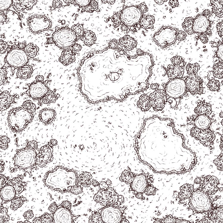
Well hello there my lovely horde of Adepts/Experts, I didn't see you there! Come, take a seat, look at this glossy jpg I've prepared for you- it's mostly a picture of some grass I drew, now featuring stumps!
This time around your alternate version is another 'grim' recoloring of the original, just in case the normal was a little too flowery for your world and you need something a little more grounded in reality. A little desaturated, a touch darker, but just colorful enough to remind you that I like my maps vibrant. I think a version of this map with my regular palette would be somewhere between this one and the original, which probably would have been a good thing to make if I had thought of it before now.

1. As simple as a forest map is there's always thought that needs to go into it, especially with trees this big. I wanted the trees to be laid out in a way that provided some small secondary clearings and broke line of sight between them. The bushes are placed so that there are lanes that can be taken around the tree's cover, and since bushes are soft cover that mostly just break line of sight they can be moved through in a pinch. I did move a number of bushes around after this step, if only for the sake of looking somewhat more natural (which is typically my priority).
The pools are an interesting piece of terrain that I thought gave the map a nice mystical vibe and break up the space nicely, they and the map in general was inspired by this gif by Capefoxalix on Tumblr, which struck me as having wonderful atmosphere.

2. Due to the nature of this one most of the outlines are brand new, a rare occurrence these days. In fact, beside a few patches of rocks, everything is freshly drawn- even the bushes which I thought were due for a fresh iteration.
The trunks were a bit of a puzzle. I wasn't sure how much of them to draw, it was tempting to leave the cross-section an undetailed void since they wouldn't be visible to players anyway, but that didn't feel right. As it is, I think it does a good job of being detailed enough to be satisfying to the eye without drawing unneeded attention. I did get tired of drawing them after about 6 though, which is why you can find doubles a little easily if you try, though I mirrored a few to make that a little trickier, and I assumed that few people would be paying attention to that when the coloring is so flashy.

3. Colors! This was a lot of fun, I got to use a lot of effects that I rarely make use of- sunlight breaking through the canopy, lightning bugs, purple/pink shadows and vignettes. When the objective is to make the map feel like it has ambient magic it's a great opportunity to use the effects that make a map look unnatural. It was just extremely satisfying, I would definitely make a series of maps with this palette if there was interest.
The only struggle I had was coloring the tree trunks. I experimented with a bunch of colors but only a regular brown/yellow/orange palette looked quite right (I tried to make purple work for a while to no effect). The problem I kept coming back to was that the trunks stopped looking like trees if the palette strayed too far from what you'd expect, and so now, though they stand out a little more than I'd like, at least you know what you're looking at without having to think about it .

