 Home
Home

 Artists
 Search
 Recent
 Random
 Posts
Posts
 DMs
DMs
 Tags
Tags
 Random
 Importer
 Import
 FAQ
FAQ
 Account
 Register
 Favorites
 Login
Login

Subdued Forest Graveyard, Adept & Expert (Patreon)
Downloads
Content
Well howdy, Adepts/Experts! I'm back to basics, my bread and butter, forest maps! I tend to have a pretty hard time with urban/indoors maps, just because they take a lot more effort for me to make them look good, so I'm always happy to draw something verdant and forested; what's even better is next week I'll get to do it again when I make the Riverside Ruins map from the poll (I'm f*cking pumped).
As you can see, your alternate version this week is with a different palette, my subdued palette that I like to use for forest maps occasionally. I thought it was a shame that a potentially spooky map looked a little too happy, but with some tinkering with effects and colors I came up with this bad boy. Much spookier, much more atmospheric, should make for appropriately eerie daylight encounters.
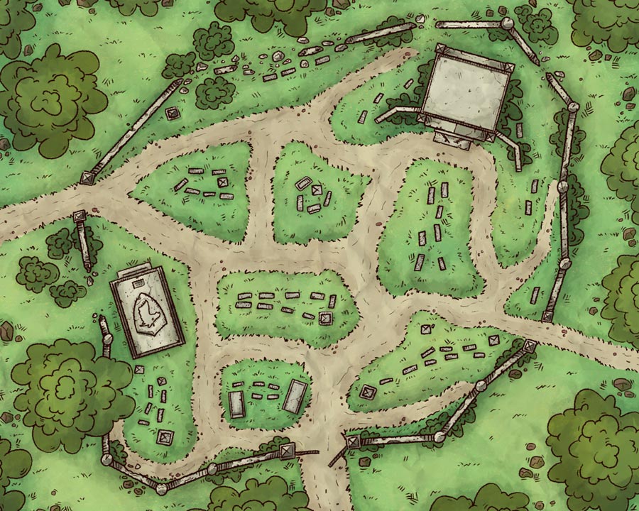
1. As I mentioned in this week's regular post, this map is an updated version of my first paid post as Neutral Party, and it shows. In the last year I've spent many hours in trial and error learning what does and doesn't work for maps as well as what specifically I need to put my time and effort into. Most obviously, to me, the trees needed to be updated the most- these oddly round bubble-trees are much too cartoony to go along with the style I set with the stone textured props. With more patrons supporting me, I was able to put more of my time into my maps, which went into the small details of things such as the trees and grass.
Other than the trees/bushes I actually still quite enjoy several aspects of this map's art. The stone textures are on point, the grass doesn't look half bad, the shading is all there, I even use the same paper texture to this day. Apparently it just needed some more experience and time.

2. Using the original image as a guide, I updated as best I could while keeping the reference in mind. I rearranged a number of tombstones and obviously fixed the scale on a number of things (I'm looking at you enormous trees and headstones). I tried not to shake things up too much, choosing instead to keep the design the same but with a fresh style. Beyond that, stylistically I didn't want to rock the boat as I wanted this to be an example of a years' work, so most every aspect of this map is drawn essentially the same as any of my other recent forest maps.
Side note, I got the idea for this from Venatus' Old Owl Well map from over a year ago, one of my original inspirations for starting a Patreon. I highly recommend checking him out.

3. Bam, color! As usual, in order to keep my maps cohesive I chose my colors directly from one of my others, the Ancient Altar. Ideally this will make them easy to tie together though multiple encounters without big stylistic differences. The color palette for the original Forest Graveyard for example is somewhat different but actually is quite similar, which I think is very neat.
Oh, and as an anniversary bonus, below is my first attempt at map-making, Big Cave. According to the JPG I made it in early March last year, a month before I started Neutral Party. I learned a lot by making it even though it's hot garbage, it was an important step to making something good.

Cheers!
Files
