 Home
Home

 Artists
 Search
 Recent
 Random
 Posts
Posts
 DMs
DMs
 Tags
Tags
 Random
 Importer
 Import
 FAQ
FAQ
 Account
 Register
 Favorites
 Login
Login

Rootbound Cave, Adept (Patreon)
Downloads
Content
Hi Adepts! This is the Rootbound Cave (35x40), a linear cave layout with lots of twisty roots and a little stream cutting across. It's a very straightforward design which I think is quite useful nonetheless, good for simple encounters or quests where you aren't looking to stress exploring the environment.
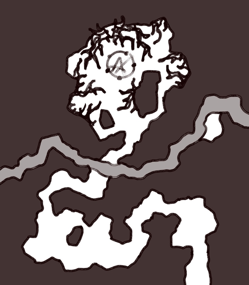
1. While it certainly isn't complicated, it did take me a little while to lay out. Caves aren't exactly simple to design- unlike buildings or outside environments the entirety of the map walled in with little room for players to skirt around the borders. This means that the map has to be complicated enough to keep players interested despite essentially fighting in a series of hallways and small chambers.
This time I decided to limit the design further by giving a single path.. plus the little stream (I thought it could give DMs a little something to work with). Winding, multi-pathed caves often strike me as unfocused and complicated for the sake of being complicated- which is sometimes necessary for the encounter at hand of course. I guess this time I just wanted to make a simple one, and that's that.

2. I started this week off with an unusually high level of focus that got me through all the detail work in record time, leaving me a 1 1/2 days ahead of schedule by the time I finished the bulk of the outlines. It helps that the map is a simple concept without much to complicate it, that's always a little treat.
The only real speedbumps here were the roots- the rest of the map is pleasantly simple (at least it has been since I began drawing caves in this way). I tend to overthink things that should be random, agonizing over whether they seem truly random or not. Roots aren't entirely random, but still I didn't want any group of roots to look too similar or overly interesting, they ought to fill the space necessary in a unique way that matches all the rest. Like I said, overthinking.
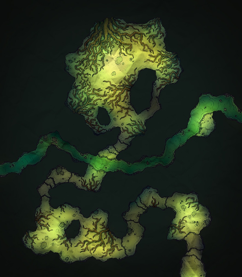
3. Shading caves is haaaard. I want them to be dark so bad but dark maps suck. Instead I try to lean toward shadowy corners/halls and brighter chambers. The effect is visually interesting but unfortunately does tend to imply that there's a light source in the room somewhere, which I wish I could avoid. To summarize: dark maps are realistic but ugly and too hard to parse, maps with balanced lighting are interesting and attractive but unrealistic. Not a particularly difficult choice, but it's something that I'm forced to think about every time I make a cave map and this is my blog post so I get to talk about whatever I want- any of you watching Taskmaster on YouTube? Really good show and it's all online for free so definitely give it a watch, the most recent seasons have been excellent.
Files
