Home
Home

 Artists
 Search
 Recent
 Random
 Posts
Posts
 DMs
DMs
 Tags
Tags
 Random
 Importer
 Import
 FAQ
FAQ
 Account
 Register
 Favorites
 Login
Login

Haunted Shores, Adept (Patreon)
Downloads
Content
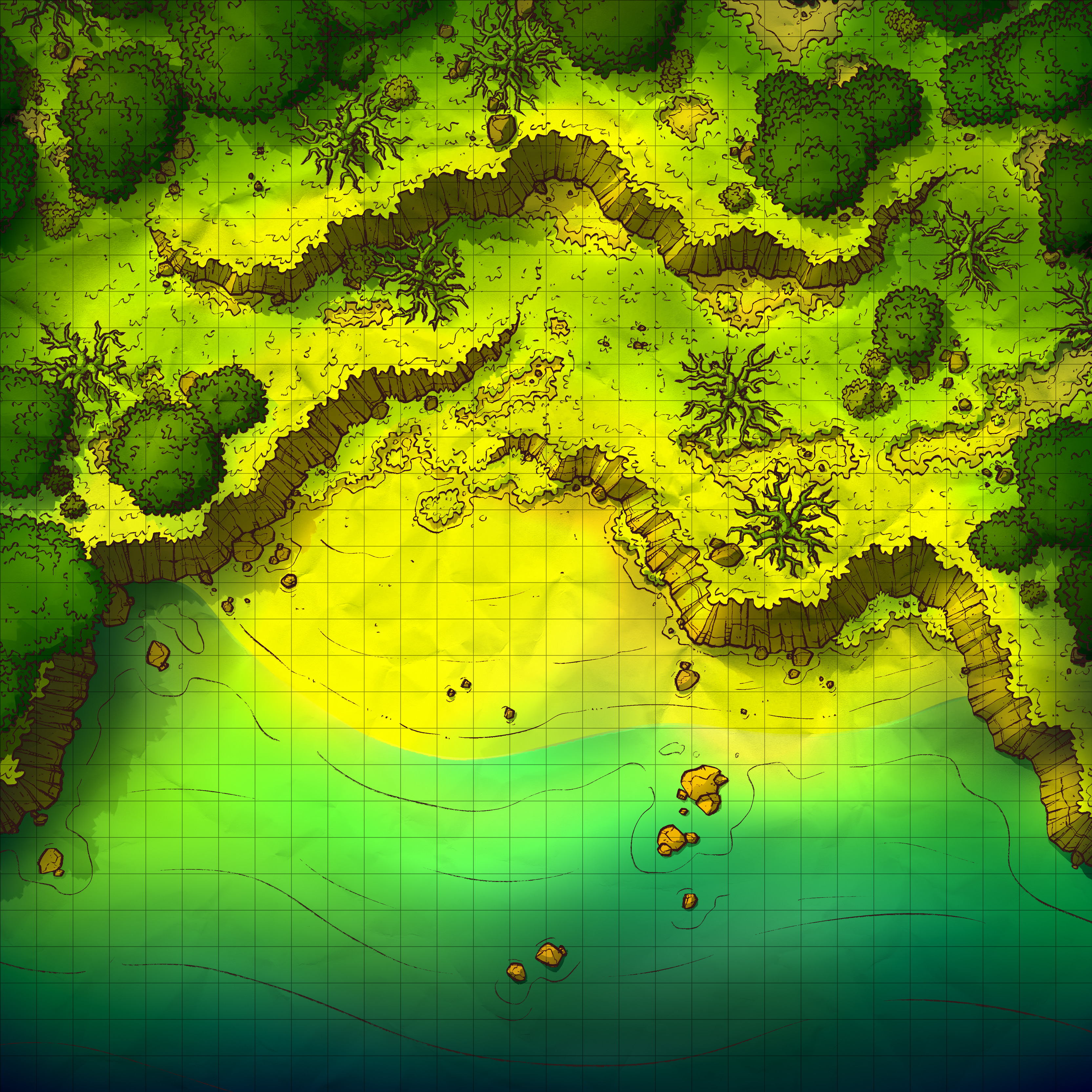
This week's map is the Haunted Shores (30x30), another Haunted map which I thought would add a little depth to the environment beyond the forest itself. I'm still having a lot of fun making these, so unless there's an outcry from you I think I'll keep making them until I get bored- probably 2 or 3 more if I would take a guess.
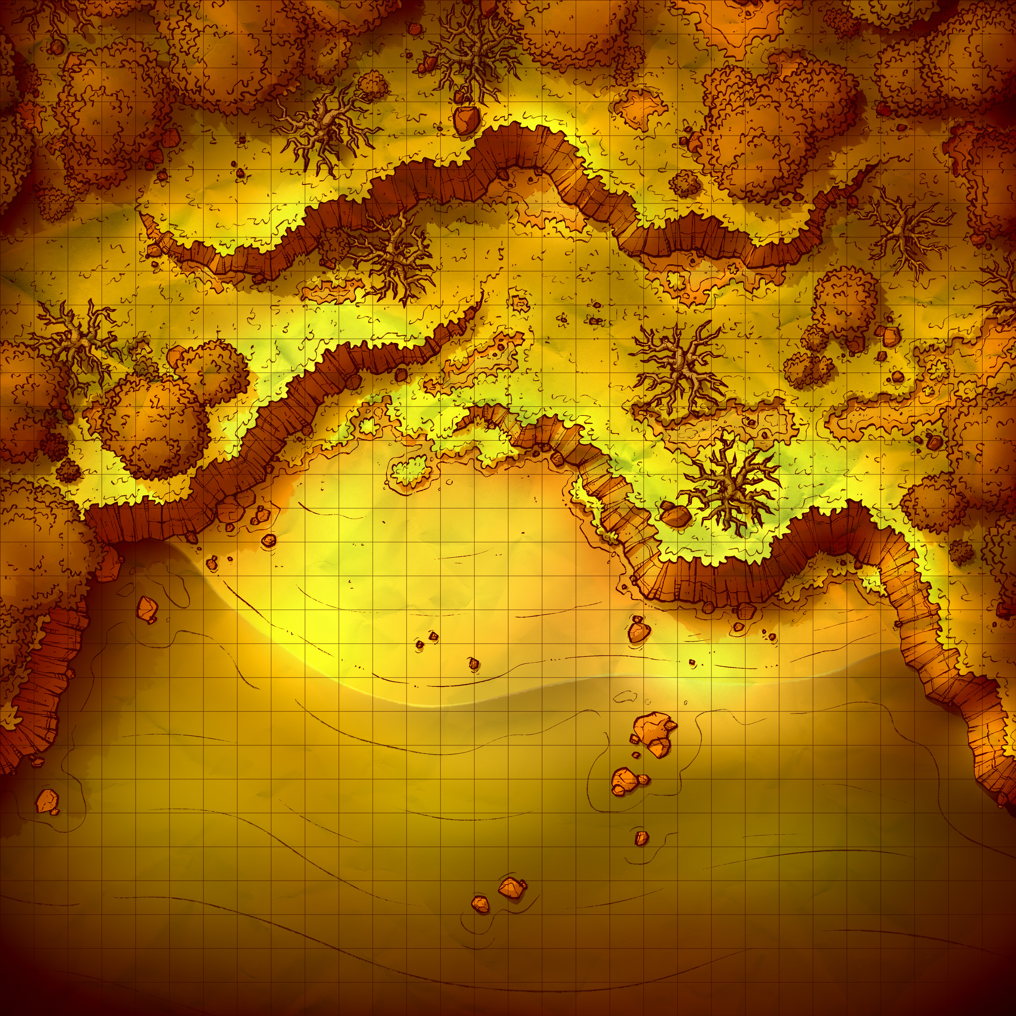
Also, I made a little bonus variant of this map for you! Your main one is the Jungle version, which features lighting and colors like my typical jungle maps, but also I thought it would be nice to provide you with something to build on the Haunted theme a little further, so I whipped up a Sunset version as well. As I've said many times in the past, Sunset variants are my personal favorite, they give the map a really cool vibe and are potentially usable by absolutely everyone, so I feel like they're never a bad choice. Hope you like it!
1. I've made a few shoreline maps in the past, but none are spooky. All those old shoreline maps are generally useful but kinda all similar- featuring sand, rocks, some plants (maybe), and perhaps a rock wall or two to help display the lower elevation of the water. Hitting those points is required, in my mind, and on its face that leads to a map that's more or less identical to those I've made previously.
To help give this map a little more of an identity compared to the others, I kept the beach itself fairly compact, making it a cove I suppose. This keeps things nicely contained and differentiates it somewhat from the rest, at least in layout, plus the lighting/coloring would make it stand out further. And, you know, spooky dead trees help too.

2. Really straightforward stuff, most of the work here involved stitching together lengths of rock wall and drawing fresh any gaps that I couldn't fill.
Side note: I'm starting to be a little self conscious about how simply I draw water. I probably should practice painting waves a little bit, it would probably add a nice bit of realism to the water, or at least some complexity. The little wavy lines I use just aren't that interesting, so I think it's time I think about alternatives.

3. I may have gone a little hard on the colors here. I boosted the contrast and vibrancy a decent amount, deepened the shadows, and made the vignette fairly darker as well. The end result, as you can see, is eyecatching but perhaps a little overboard. Simplicity might have been the better choice here, like with the previous maps in the series, but I just can't be completely happy with something tried and true, you know?
Files