 Home
Home

 Artists
 Search
 Recent
 Random
 Posts
Posts
 DMs
DMs
 Tags
Tags
 Random
 Importer
 Import
 FAQ
FAQ
 Account
 Register
 Favorites
 Login
Login

Desert Gates, Adept (Patreon)
Downloads
Content
This week's map is a rare desert map, the Desert Gates (35x30)! And as rare as desert maps are, urban desert maps are even rarer, so I'm sure some of you will be pretty excited about this one. On top of that, I had a lot of fun making it, so I'd be very willing to make a few more like it if that's what the people want. Let me know!

1. Desert maps are often tricky to make maps of because there isn't a lot of design space to work with. That's not so much an issue here though, borders between environments are always an interesting setup for a map and easy to make visually interesting with more than enough props to make up for the innate emptiness of the desert. With that in mind, I didn't try to add anything of interest to the desert, and and laid out the city portion to be a regular level of cluttered, with a few small alleys and buildings laid out at right angles to each other.

2. As deserts aren't exactly my most common map, I didn't start this one with a lot of props to work with. So, I made do- I used my pre-made brick wall PNG for the wall edges, my pre-made tile PNG for the wall's ground, and a selection of props/stalls/trees which I lifted from the Desert Bazaar, my most recent urban desert map which I apparently made 3 years ago (yikes). I also took the brick ground texture, which I chopped and screwed to fit this space a little better. I kinda like how it turned out too, I placed it in here as an experiment and eventually decided that it looked nice enough to stick around. If I make more urban desert maps I'll need to think a little more critically about it, but for now I'm pretty happy!
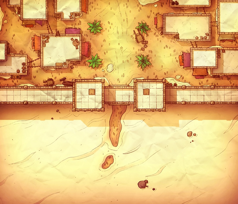
3. And here we are. I've been saying for weeks that I was going to take another crack at the palettes of non-forest environments and now I'm finally giving deserts another try. How do I think this one went? Eh, I'm feeling iffy about it. I always find the vignette on desert maps to look great while I'm working on it and awful in the coming days. The palette itself is maybe a few shades too orange as well, especially in the city, and the green palms are also 10-25% too vibrant, I think. I'm fairly happy with the color of the city's props though, that's not too bad, but the wooden props' color is too similar to the color of the ground for my taste. Overall, too vibrant, too orange, would benefit from a greater array of colors (if that was a realistic avenue for a desert city).
I give this attempt a C+, would have benefited from a bit more tlc. I have a good idea of what to do next, however, and I think this maps colors are a decent place to start for the next attempt, so not a complete loss. We'll see how the next one goes.
Files
