 Home
Home

 Artists
 Search
 Recent
 Random
 Posts
Posts
 DMs
DMs
 Tags
Tags
 Random
 Importer
 Import
 FAQ
FAQ
 Account
 Register
 Favorites
 Login
Login

Cellar Tunnel, Adept (Patreon)
Downloads
Content
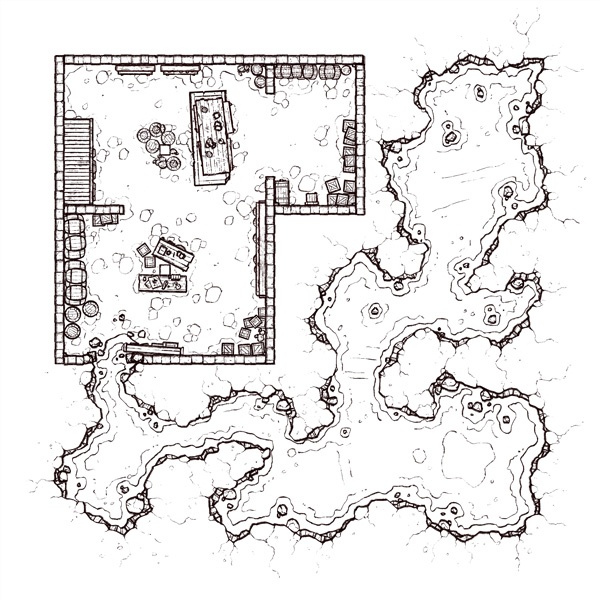
Hello folks! This week's map is the Cellar Tunnel (20x20), a tidy cave connected directly to someone's basement- and that's either a really bad thing or a really good thing, depends on if you're a 'glass half full' or 'glass half empty' kind of person I bet.
Your alternate version of this map is Infested- a variant where I've added big yucky eggs to the cave and altered the lighting to be a little more murky and hazy. I decided that the color change made the cave feel more.. infested? I don't know, it felt right. I can't explain it, and so I won't try!

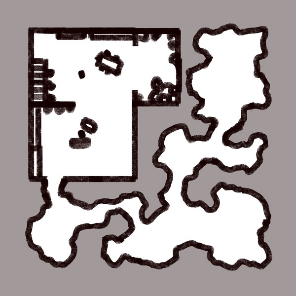
1. I had a late start this week (I'm moving this week), so I began the map with a large sketch and scaled it down until I was left with something I felt I could reasonably make with the time I had. And, since I was starting off with 2 fewer days than usual, I ended up scaling back pretty far.
But the basics of the map still remain the same- we've got a decently large cellar, fully stocked with all the usual trimmings like boxes, shelves, and barrels, and we've got a small-sized cave with plenty of cramped tunnels and a few slightly larger rooms for tiny battles. I think it's nice and balanced!
 2. Once again, another cave map that's improved by the new way I'm drawing them now. I'm getting faster at drawing them this way too, it's not nearly as obnoxious as it used to be, and having more layered cave walls with the outer darkness placed above the walls makes lighting/shading significantly easier. I promise I'll eventually stop gushing about how nice my new cave style is, but not today.
I don't think that I tried anything different here, cellars are pretty easy to populate with props, especially when I have so many pre-made props on hand from the hundreds of maps I've previously made, so really I only had to draw the floor beneath them.
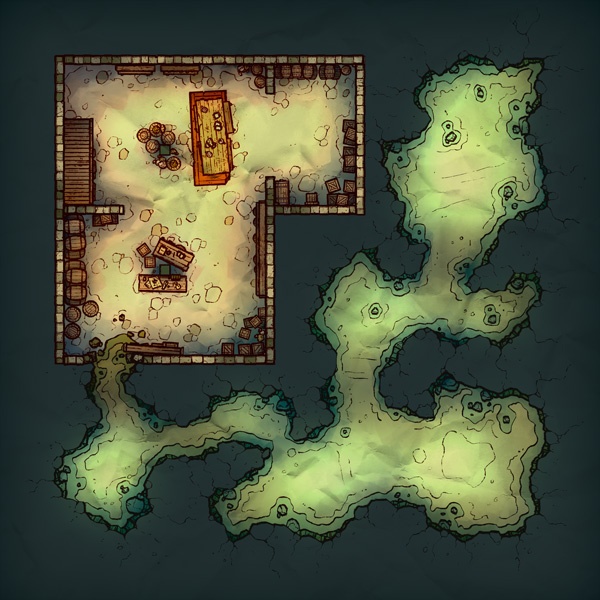
3. I went through quite a few palettes for this map, I was very wishy-washy about it. I very nearly ended up with the cave being primarily shades of orange and brown, but while tinkering with variants I became intrigued by a teal tint I applied to the cave's lighting, and with a little soul-searching and a coffee break I decided that the map would be more visually interesting if there was contrast between the cellar and the cave. And once I had put everything in place I realized how much of an important change that was, it became very obvious that the original colors were way too same-y overall.
As always, I have to be very conscious of the lighting for cave/interior maps, because I tend to make these maps waaaay too dark. And due to being aware of that I eventually start to wonder if I'm going too far in the other direction, washing out my colors and making a traditionally shadowy environment glaringly bright. Did I do that this time? I don't know, give me a week without looking at it and I'll have an opinion!
Files
