Home
Home

 Artists
 Search
 Recent
 Random
 Posts
Posts
 DMs
DMs
 Tags
Tags
 Random
 Importer
 Import
 FAQ
FAQ
 Account
 Register
 Favorites
 Login
Login

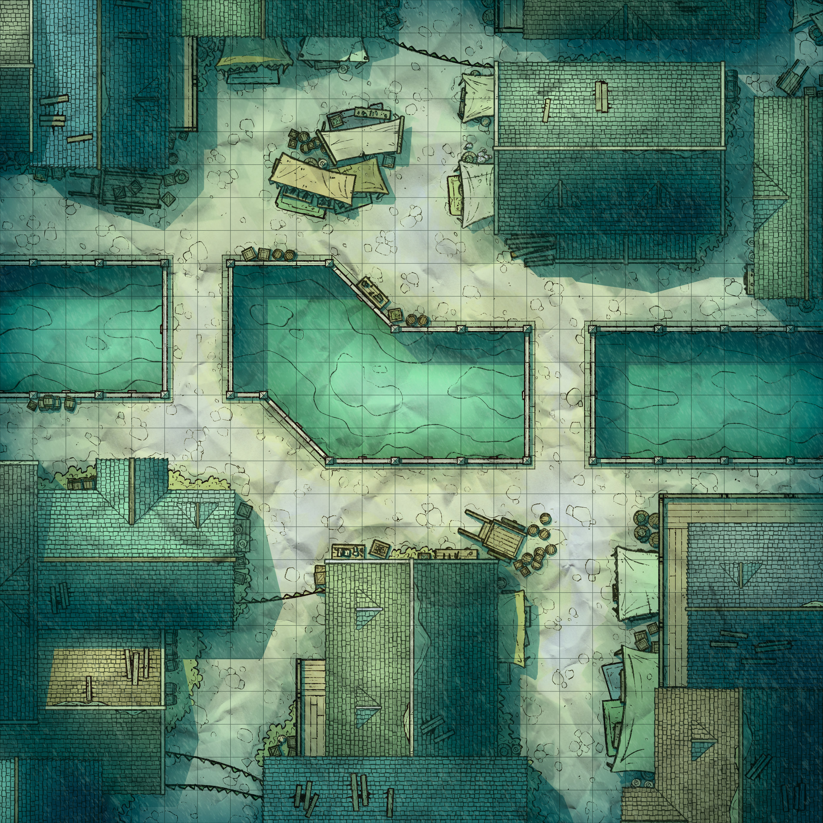
Bustling Channel, Adept (Patreon)

Downloads
Content
I'm back again, this time with a new city map- the Bustling Channel (25x25)! I haven't made a regular city map for a little while, and since I've been prioritizing simpler maps recently I wanted to take a crack at a nice and simple city map. So, this time I whipped up another city canal map and kept it nice and simple, nothing crazy or too exciting- and that's just how we like it!
1. I felt like making another canal map, this time around. It's been a minute since the last one and I took a look back at the two I had made, City Boulevard and City Canal, and decided I wanted to take another crack at one that wasn't quite as rigid a layout as the Boulevard and not as jumbled as the Canal. So, this time around I tried to cut the difference between the two, with a more interesting stretch of canal that isn't just a straight shot and a more compact layout of the buildings, which I feel comes across as more interesting.
Side note, I left that open area in the market because I wasn't certain what I would place there. Any open area in a city is usually rapidly filled by a well or fountain, but after trying out one or two options I thought that the layout felt a little too cluttered in a way that felt kinda dumb, like no one would have ever put a fountain there. Anyway, filling out the space with more stalls felt natural and cluttered in good way.
2. I messed up. I accidentally used my old roof texture. I only noticed when I had placed all the roofs and was wondering if I had saved the windows separately somewhere, glanced through my files, and realized that I had neglected to grab my most recent roof tile texture. By this point I was utterly unwilling to arrange roofs again and was resigned to my fate. To make things right I cleaned it up a little bit, which is really all I could do without sinking so much time that I might as well just start over.
As always, I ripped the market stalls from a past map, the Parkside Market and the props came from the Desert Bazaar, and as I have said since the beginning: I see nothing wrong with reusing old props and if you do then I hope you'd stop to consider why. I see no reason to draw barrels, crates, and wagons for every city map as long as I'm not doing so in a way that draws attention to the repetition. I know no one is currently complaining, but it's been a while since I've expressed these thoughts and someone always eventually complains.

3. Colors! I took yet another crack at city colors/lighting, starting from scratch and trying lots of different things out. This time I leaned a little bluish/greenish, keeping the contrast nice and high, and leaving the paper texture much more visible than usual. I think some might consider any/all of these choices obnoxious, but I think they're each pretty nice.
Also, I feel like this one might be one of my most readable city maps, somehow? I'm not entirely sure why, but it doesn't feel over-complicated like many of them have, and in fact there's a sense of balance which I usually fail to achieve. I suspect it's mostly due to there being a nice feeling of clutter, but the colors are definitely an element of it as well.
Files