 Home
Home

 Artists
 Search
 Recent
 Random
 Posts
Posts
 DMs
DMs
 Tags
Tags
 Random
 Importer
 Import
 FAQ
FAQ
 Account
 Register
 Favorites
 Login
Login

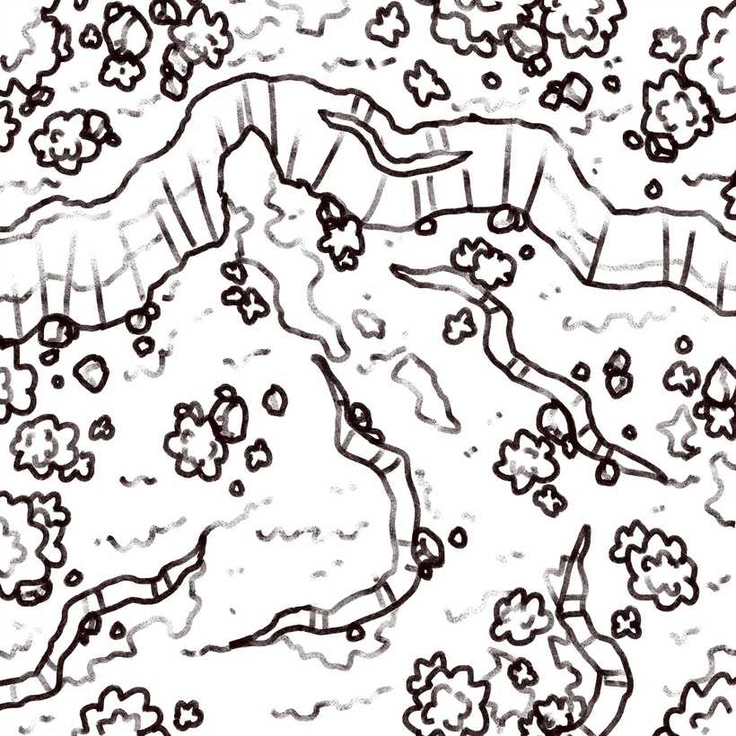
Forest Cave, Adept (Patreon)
Downloads
Content
Hello there, Adepts! This week's map is the Forest Cave (40x40), a somewhat bigger map than usual that features a hearty expanse of rocky forest as well as the entrance to a cave tucked away at the back. This is a nice map to use as you prepare your party to enter a cave, perhaps hinting at what's living inside there or outright fighting some of the inhabitants guarding the entrance.
Your alternate version of this map builds on that by implying a more sinister adventure lies ahead, with a spooky spectral glow emitting from the cave entrance and a touch of fog spilling out. I imagine the local village folk might have rumors about this sort of thing happening and could be convinced to discuss it further at the inn.. if perhaps you bought them a drink?
1. I'm once again working on forest maps and it's been really nice! I have a genuinely good time designing these maps, I feel like I can focus on the layout rather than spending time ensuring the terrain feels believable. I think I might make one or two more as we head into the Halloween season, maybe with a flow to them and a spooky ending location? Even if I don't, there are plenty of seasonal maps in my archives that would do the job, no problem.
Anyway, I built this map with the idea of making a new version of my Roadside Clearing map that didn't feel like it was 15 feet off of the roadside, something that felt like you had to travel deeper into the forest to find. An easy enough starting concept for me, I filled in the necessary details (a rock wall big enough to nestle a cave into) and filled in the rest with what I thought to be interesting terrain for a battle.
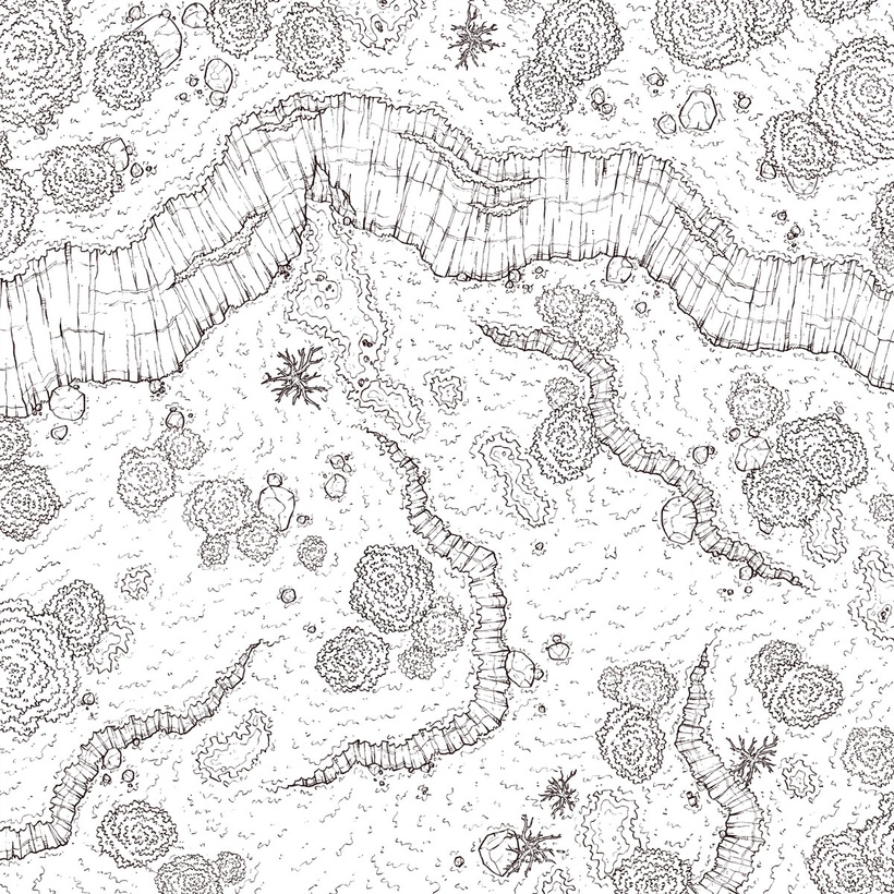
2. Lots of rock walls, it's enough to bring a tear to my eye. At least the little bits are big enough and shaped generically enough that I could copy them into a future map without needing to make many alterations. The big wall is unusable for future maps, but that's just how it be sometimes.
Drawing up the rock walls took up much of the week, or at least it felt like it did. Ensuring the perspective on the big wall felt right was most of the problem. When it comes to big rock walls, making sure that the contour lines don't make the wall seem like it's being looked at through a fun house mirror is the problem. Trickier than it seems at a glance, I'd say.

3. And here's my next swing at revamping my forest palette. The shadows, particularly, are pretty different with a much more subdued blue. The trees and grass are similarly a little more subdued, but not nearly as much, with less variation in color between high and low points. Overall, a more flat-feeling map, but a more solid design that comes across as significantly more realistic than many of my recent, more colorful maps.
I finished coloring this map a couple days ago now and, now that I'm putting eyes on it again I feel like maybe I overdid the shadows a touch and darkened the trees a little more than necessary, but overall I'm very happy with the end result. And really, those downsides aren't too bad, I think they give the map an early Autumn vibe in a pleasant kind of way, and might in fact be a fun palette I could work on separately for a future map.
Files
