Home
Home

 Artists
 Search
 Recent
 Random
 Posts
Posts
 DMs
DMs
 Tags
Tags
 Random
 Importer
 Import
 FAQ
FAQ
 Account
 Register
 Favorites
 Login
Login

Volcanic Cavern, Adept (Patreon)
Downloads
Content
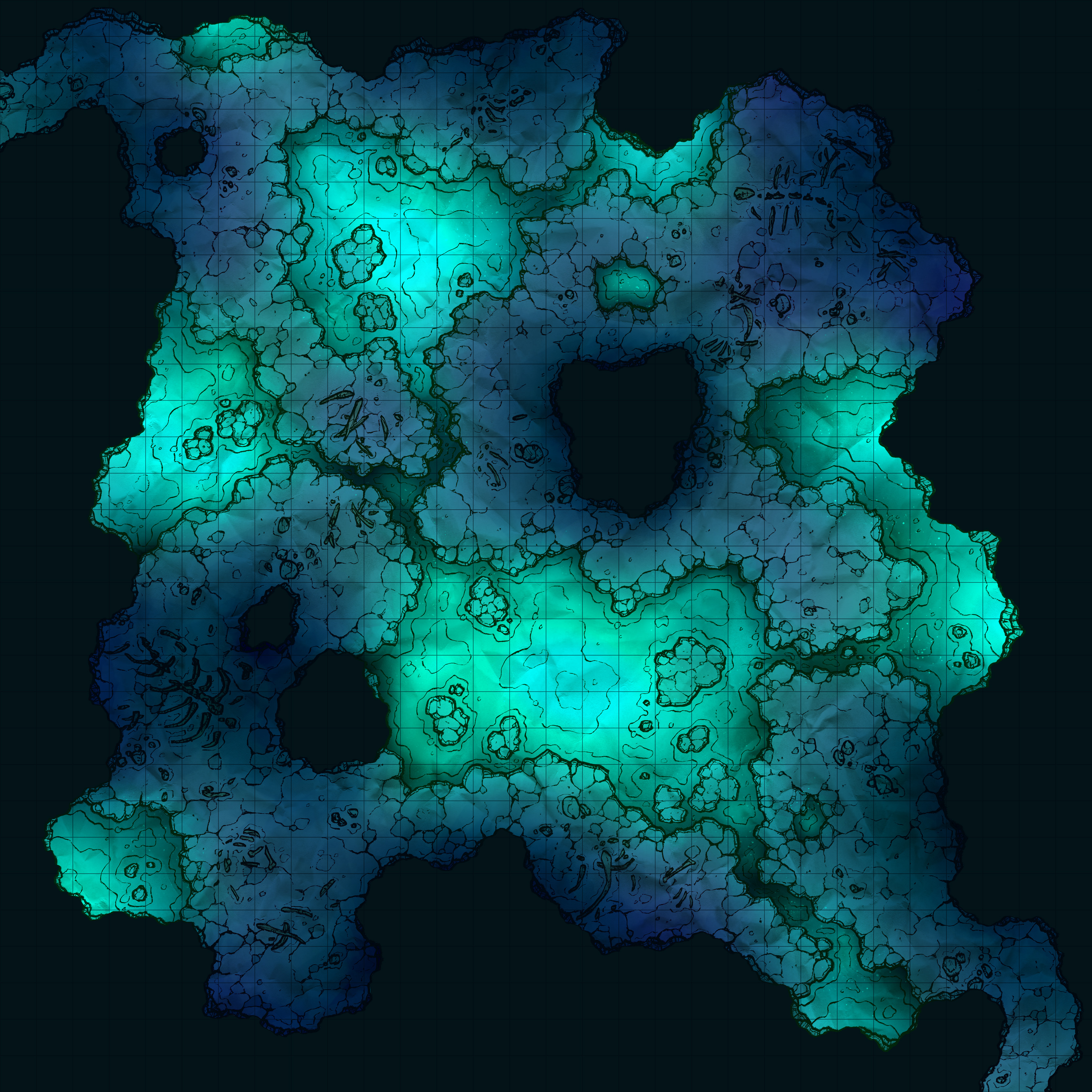
3This week's map is the Volcanic Cavern (30x30), a pretty simple cave map with a few pools of lava to add some excitement! The layout is somewhat simple, but I've been enjoying making basic and straightforward maps recently, feeling that they're much more easily used in the average campaign than the more complicated ones I sometimes make. And I've heard positive feedback about this recent pivot too, so I think I'll stick to the theme for a little while and see where it goes!

1. I started this map off with a fairly basic concept in mind, a nice and open cave with pools of lava restricting movement and creating a handful of paths. I was pretty content with this as I began the outlines, but after drawing in the outer cave walls decided that this was excessively simple.
My solution was too zoom the map in slightly, skootching the cave walls closer to the edges of the frame, add a few carefully placed rock columns here and there (to block line of sight and create a more interesting space), and connect some of the lava pools with small streams of lava. The extra lava streams, while not a big obstacle to leap over, are dangerous if used properly by enemies, DMs, or players. Perhaps the streams spit out sparks occasionally, potentially lighting nearby flammable objects ablaze, or maybe an enemy could be pushed backwards toward one and potentially tripped into it, or maybe native monsters move quicker over lava than stone. Lots of fun options here, I think!

2. Yes, I finally took the easy way out and drew simplified rock walls. On a normal week I might not have considered it, but since I took off Labor Day this last Monday to play a SW5e (Star Wars overhaul of D&D 5e) one-shot with my buds I was going to have one less day to work this week than usual, so I decided to be a little frisky.
I've seen other mapmakers draw their caves like this and I've always been envious of how much time they probably save doing it, so since this map has no others themed like it in my archive (volcanic/cave) to compare against I decided to give it a go. My impression on how it turned out? I think I could have handled the lines a little neater, they feel a little messy and maybe over-detailed. I might also add an extra layer of depth to them too, if I try it again. Really though, I'd love to hear your thoughts about this pivot- I'd be willing to make cave maps more often if I didn't have to spend so much time on the rock walls, but I'm not certain yet if this is an improvement. Input appreciated from anyone with an opinion!

3. Another difference that comes up with the different rock walls is the somewhat limited frame, the map feels smaller even though there's actually more room for me to fit terrain into the frame than before. However, maybe it's just that the dark blue of the wall feels more restricting, so perhaps in the future I'll play around with lighter palettes.
Beyond that, I've stuck to the same palette as the Lava River, which I think was my personal favorite map from this exploration of Volcanic terrains. The purples of the ground feel right for my type of map, despite being a touch more colorful than some might prefer, and they stand out nicely against the reds and yellows of the lava. Perhaps in a future return to volcanic maps I'll toy around with adding more texture to the lava, but for now I'm pretty content with how the coloring developed for these maps.
Files