Home
Home

 Artists
 Search
 Recent
 Random
 Posts
Posts
 DMs
DMs
 Tags
Tags
 Random
 Importer
 Import
 FAQ
FAQ
 Account
 Register
 Favorites
 Login
Login

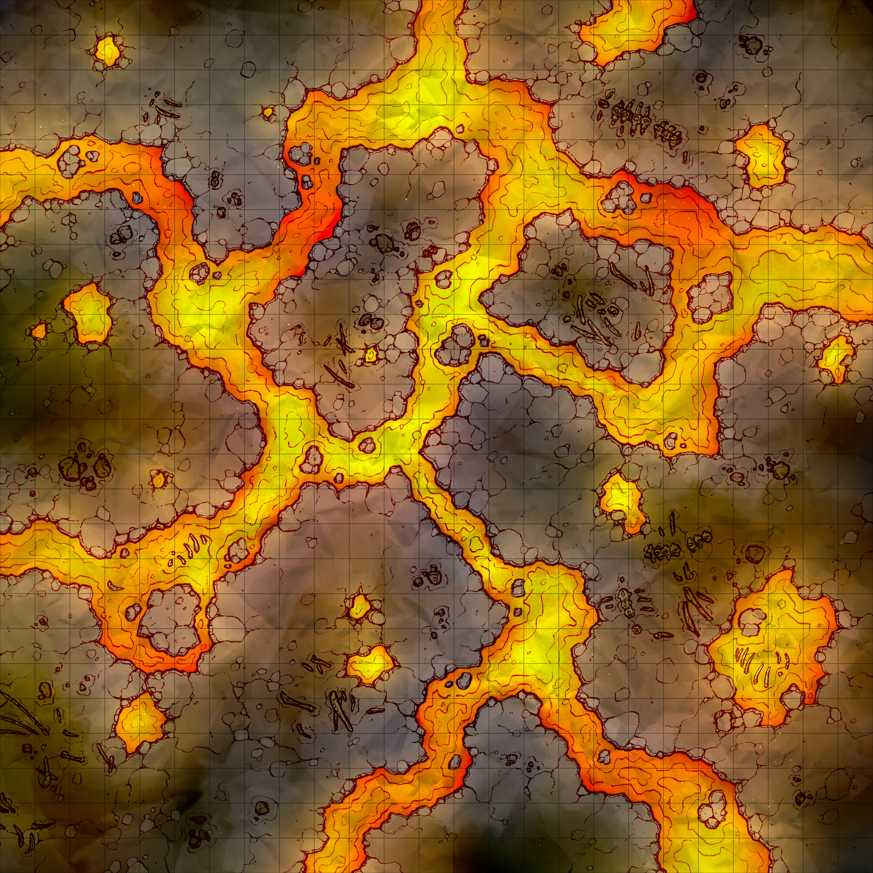
Lava Fields, Adept (Patreon)
Downloads
Content
Hi Adepts! This week's map is the Lava Fields (25x25), a basic lava map for when you're in-between your volcanic destinations. I imagine this will be about as useful for volcanic biomes as a forest clearing would be for forest biomes, not intended to be extremely exciting but it's the map you'll often need while traveling.
Your alternate version of this map is a fairly simple color swap, which I'm naming 'Grim', a variant that loses some of the magical and pleasant vibes of the original version and substitutes with dangerous and evil vibes, like we're approaching the baddy's lair or traveling through hell. Fun!
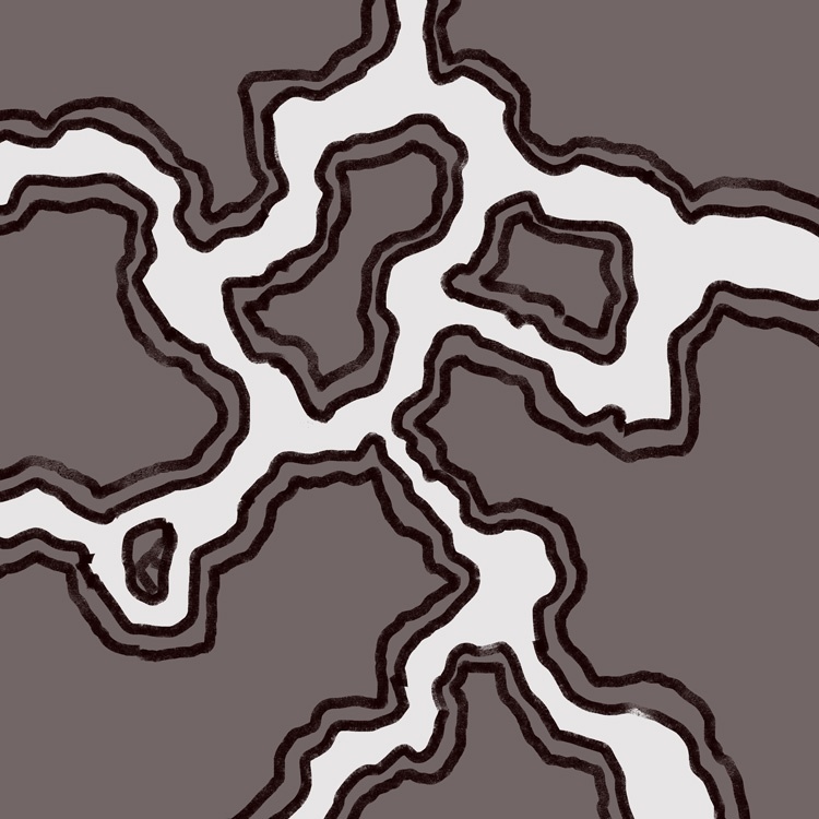
1. When making basic maps, the ones that are intended to bridge the gaps between locations, I think it's important to make sure its not overdesigned and includes the key features of the environment. I might have lost the plot here a little later when I added in some bones (for ambiance), but the basics here are rocky platforms separated by streams of lava. No ruins, bridges, or roads, just the basics.
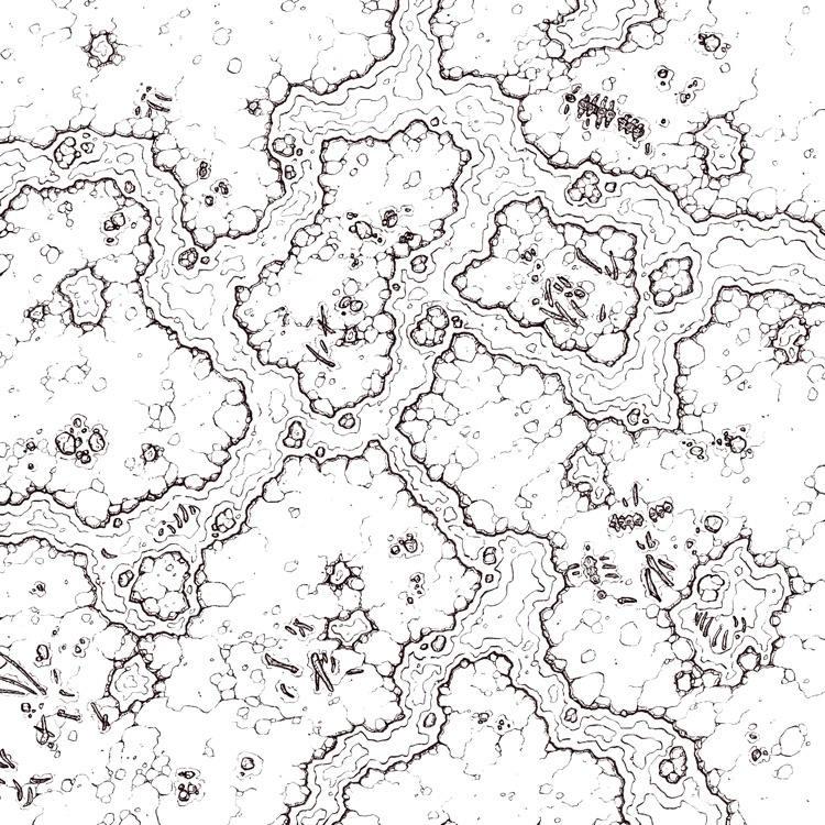
2. I realize that, once again, I signed myself up for yet another map with a huge amount of rock walls- one of my least favorite things to draw. I started off resigned to that fact, thinking I would start my usual process of drawing the lower edge of the walls and then carefully drawing the upper ledge to follow that line. I'm a kind of guy who loves methodical routine, so when I get in the swing of things I tend to forget to consider other possibilities. This time I was really not looking forward to all these rock walls, so before I finished the second, inner ledge lines I decided that maybe I'll just play it fast and loose with the walls and just sketch in a few details to give the impression of height. The first platform I tried this on looked pretty great, so I plowed ahead, happy with the time I saved.
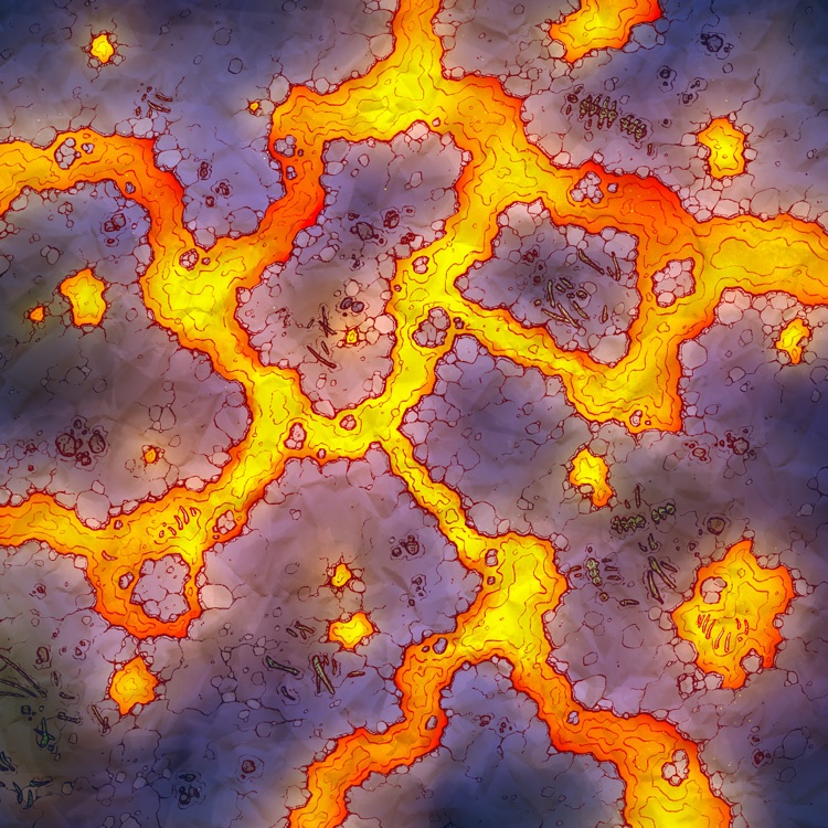
3. Wow, I spent so much time tweaking and retweaking these colors. My original pass had vibrantly blue rocks and blindingly glowing lava, which I thought was funky and maybe cool, but after stepping away for a little while and coming back with fresh eyes I decided was unacceptably exciting. My next pass was more bright purple and too light, the next pass too dark. The real issue I kept coming across was balancing the brightness of the lava with the darker platforms- I want to include a somewhat full range of light and shadow with my maps (when possible), which can lead to issues occasionally.
I ended up settling for something in the middle of everything I tried, featuring blue-ish purple rocks and a fairly balanced light level for the lava which grows brighter toward the center with patches of lightness further out. I'm still thinking that I might make more adjustments for future volcanic maps, probably starting with some slightly altered palettes for next week's map. We'll see!
Files