 Home
Home

 Artists
 Search
 Recent
 Random
 Posts
Posts
 DMs
DMs
 Tags
Tags
 Random
 Importer
 Import
 FAQ
FAQ
 Account
 Register
 Favorites
 Login
Login

Sandy Islet, Adept (Patreon)
Downloads
Content
Hi again, folks! This week's map is the Sandy Islet (40x40), a small and mostly bare island with just a few spots to get some cover. I'd like to say that I was inspired to make this map and simply had to get it down on paper, but actually there were some unexpected health problems in the family which needed my attention, so I made a map which I knew I could knock out with the time I had available. That's how it goes sometimes, what can you do?
Your alternate version of this map is a Rainy variant, and once again I've been workshopping it. This attempt at stormy lighting and effects features more gloomy lighting and greenish colors which, as I look out my office window at a rainstorm, feels pretty accurate.
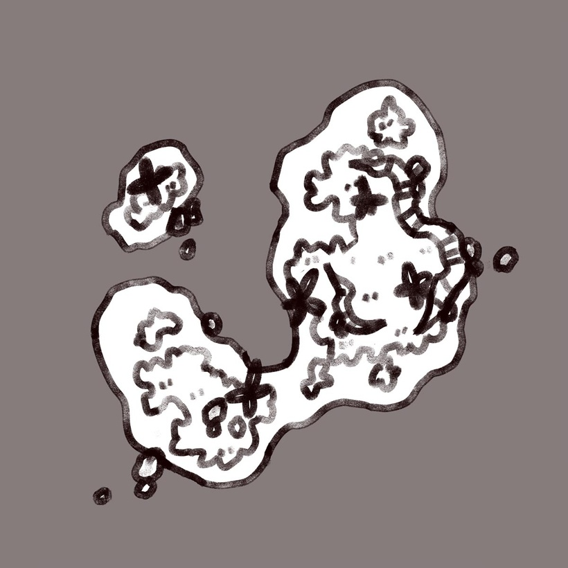
1. This time around I wanted to make an island that featured fewer rock walls and more beach. Even though this might make for a less interesting map, thought this would fill a different niche, kinda like those little sandbar island covered in skeletons in Sea of Thieves that feel like a gladiatorial arena due to the lack of complexity.
Anyway, this layout was as complex as I could manage without making it so complex that it would feel over-designed. Really that's all there is to it, this time- a bit of sand and a handful of trees. Sometimes I forget that environments aren't always super complicated!

2. It's here that I got caught up in the dream of losing some of the outlines for the final version of the map. I liked the idea of not having an outline for the shoreline, or at least tinting the shoreline so it blended into the water more. I toyed around with that for a very very long time before moving on to the colors, trying out a few styles of fading the sand into the water, but I gave up and reverted back to a fully outlined version.

3. ..Only to go and do it all over again once I had everything colored! The thick, dark outline felt so jarring to me now that I convinced myself that the map might be better without it, so I got back to experimenting, now also fighting lighting effects and working alongside the final colors. The final version I ended up with erased a decent amount of outlines near the shore, not just the shoreline itself, which I felt were overcomplicating the now simplified waterline. The water itself starred several layers of gradients which I used as tests to see how yellow I could tint the water near the shore before it turned bright green.
The rest of the colors were a little experimental as well. I've been looking at my recent maps and I felt that I might have gotten a little too bold with my color choices, which are downright blinding compared to my older maps. So I decided to take a more middle ground this time, at least with the island itself, the water's color is just as vibrant as before, if not more so. If this direction is received well then maybe I'll continue to take a more measured approach to my maps from here on out, we'll see.
Files
