Home
Home

 Artists
 Search
 Recent
 Random
 Posts
Posts
 DMs
DMs
 Tags
Tags
 Random
 Importer
 Import
 FAQ
FAQ
 Account
 Register
 Favorites
 Login
Login

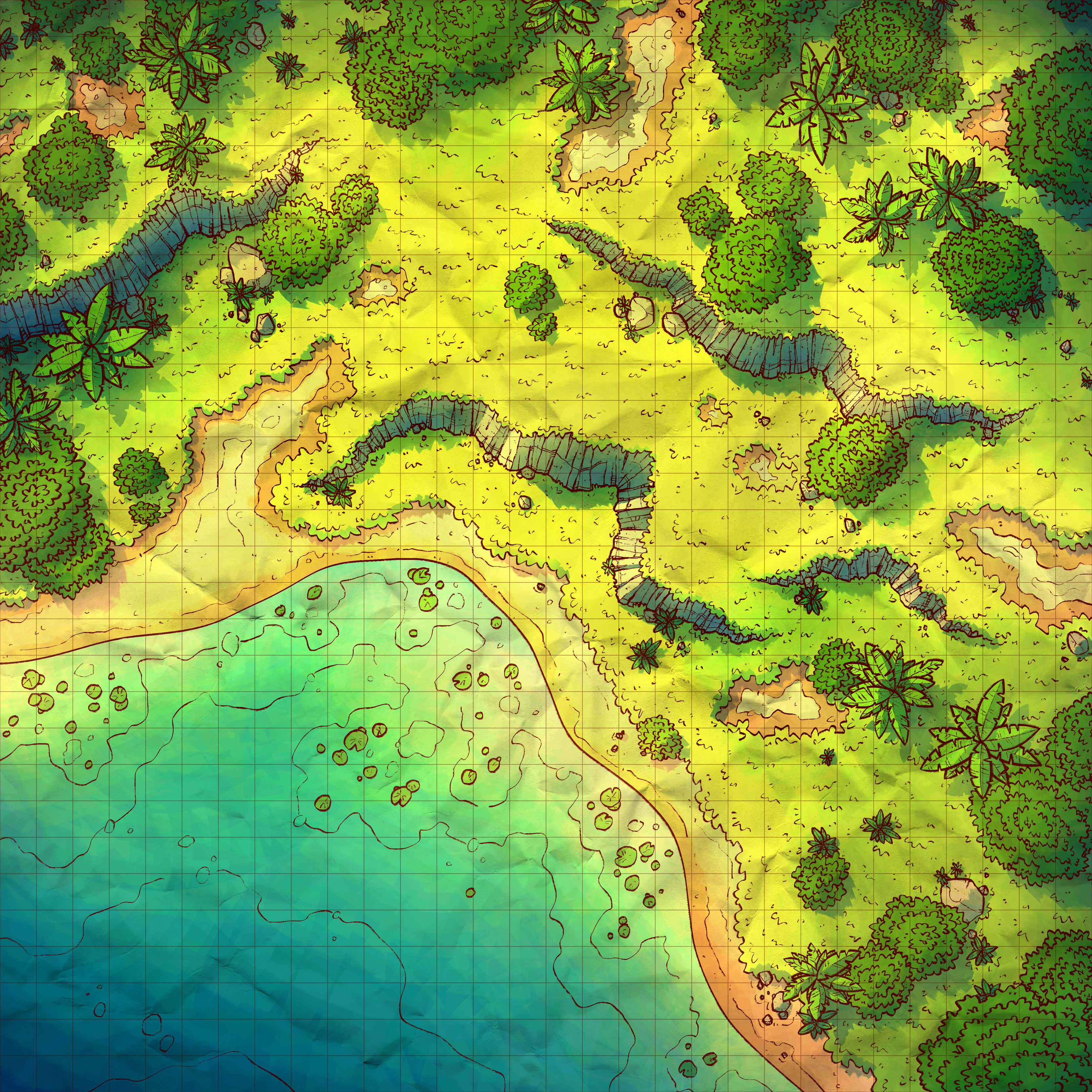
Jungle Shore, Adept (Patreon)
Downloads
Content
I'm back! This week I made the Jungle Shore (30x30), a quick and simple map to help me get back on track after spending a few weeks posting 1-2 days late. I'm not complaining though, I like making forest maps, and the numbers say that most of you like them too even though a vocal few will often appear and tell me how they want to never see another forest map again. But that's just how business goes on the internet, right?
Anyway, your alternate version of this map is Tropical, meaning it features a less 'jungle-y' palette and instead more similar to what you'd see in my regular maps- which has always felt a little tropical to me. And even if you disagree, I feel like it looks more cheerful and certainly more beach-y, so I'm confident it'll find different ways to be used than the original.
1. Uhhh, I can explain: my original sketch above was boring. I felt that a plain jungle map with just a handful of ledges and a bunch of trees would really be extremely unexciting. The real shame is I only realized it after drawing most of it, so I wasted a fair bit of time on assets I didn't end up using. I considered a handful of ways to improve it: adding a camp to the center, a destroyed camp, ruins, a river, a waterfall, a bottomless pit. These were fine options but I was feeling artsy, so I decided to cut out a third of the map and fill it in with water, feeling that the greens and blues would make for a much more impressive visual.

2. Like I said, a big change. Considering my time constraints (I didn't want to have to spend another weekend wrapping up a map), my decision to plop in a beach was going to save me a ton of time, mostly because I wouldn't have to draw in grass. Yup, grass has turned out to be my biggest time-sink these days, but not because it's difficult or particularly time-consuming to fill in. No, it's because after making maps for 4 years I just genuinely hate drawing in all those little grass details, so what usually happens is I start drawing from one side of the map to the other, I get bored, I can't stand the thought of drawing more grass, I play Elden Ring/Super Auto Pets/20 Minutes Till Dawn/Pokemon Go for a while, I feel guilty for avoiding work, I draw for a while longer, and repeat.

3. So like I said, I took another crack at my jungle palette for this map. I tried dredging up the colors from my last attempt at a jungle, but I really didn't like what I saw- just too washed out. I guess I'll have to take another look at all of my old palettes, my new desire for more and more colorful maps has really lowered their stock around here.
Well, that just meant that I needed to start over again and try out something new. I began with the colors from the Castle Courtyard, something basic, and tweaked from there. I decided to nudge the colors more yellowish-green, feeling that that would help give off a more jungle-y vibe, alongside some nice deep blues for the water. What really tripped me up was when I exported a jpg of the map to my phone, to see if the colors held up on a different screen, and they didn't. For whatever reason, the map I see on my monitor always looks wildly different than the map I see on my phone, maybe due to the level of contrast and brightness my iphone is set to. Either way, I like to check to make sure that a map reads well on my phone and I didn't like what I saw, feeling that the result was extremely bright and pale somehow with little of the yellow tint coming through. After tweaking, I found a nice middle ground, coming up with a version which I felt looked nice on both screens without being too extreme on either.
Files