Home
Home

 Artists
 Search
 Recent
 Random
 Posts
Posts
 DMs
DMs
 Tags
Tags
 Random
 Importer
 Import
 FAQ
FAQ
 Account
 Register
 Favorites
 Login
Login

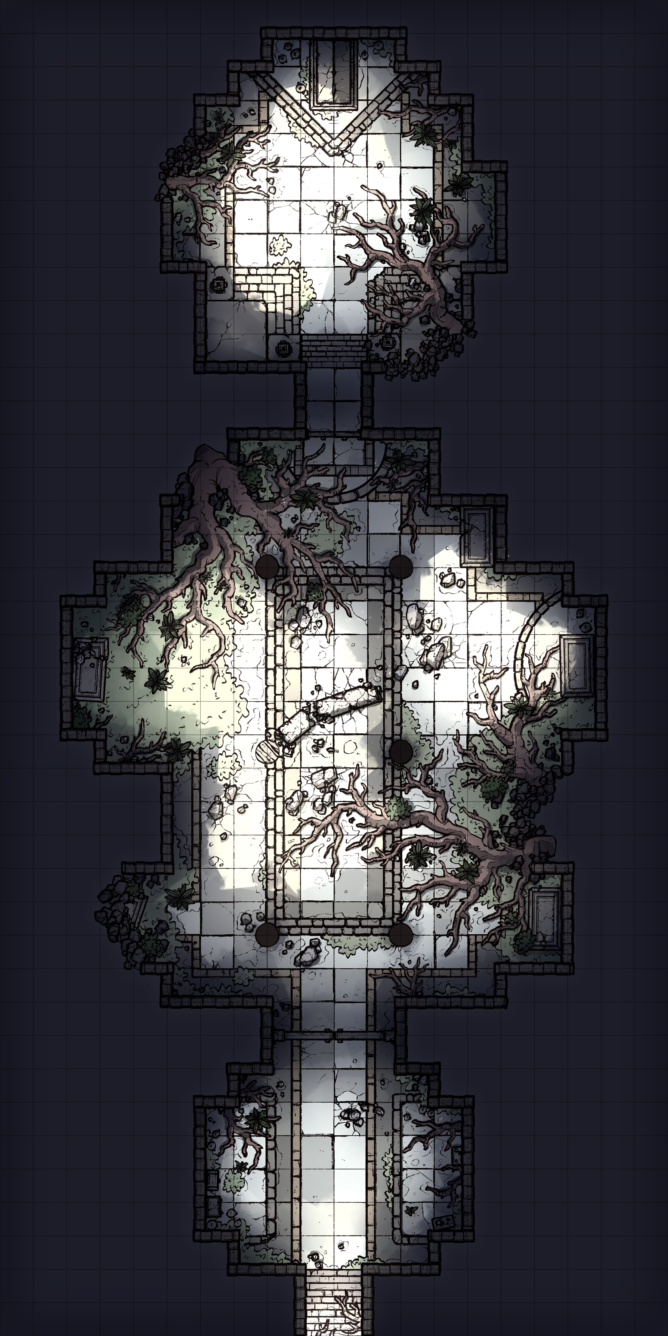
Overgrown Tomb, Adept (Patreon)
Downloads
Content
Hello again, Adept patrons! This week's map is the Overgrown Tomb (20x40), a nice and simple 3-room dungeon, featuring a large door blocking the middle room (perfect for requiring a riddle/password/McGuffin to open), a thoroughly root-ridden antechamber with sarcophagi (perfect for filling with guardian enemies), and a decently-sized tomb chamber with a big ol' sarcophagus at the end (perfect for stuffing a boss inside).
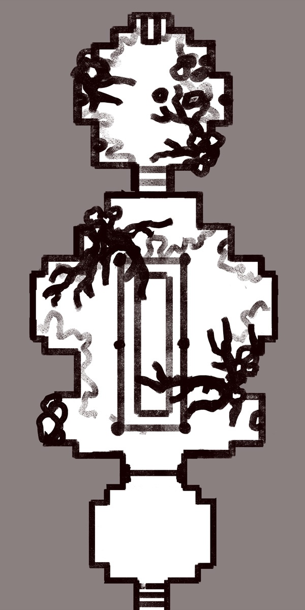
Your alternate version of this map is Stark, meaning it has less vibrant colors but more high-contrast lighting. Honestly this version reminds me of the catacombs in Elden Ring, which feel like they're lit by LED candles. The big reason why you're getting this version is that the vibe is way different than the jungle-y regular one, a little spookier even. This version feels like a place that might be filled with specters rather than fungus-y rotting zombies, which might just be the exact vibe you need!
1. Once again, the map I ended up making is very different than what I started out with (but this time I don't have an image of the first one). The map I started making was way larger, featuring large wings to the right and left side as well as at least a dozen small rooms and chambers. That was all well and good, but I couldn't even imagine what I was going to fill those rooms with, and I couldn't picture why the builders of this tomb would design the place like that. So, I cut out the side hallways and decided that I would just focus on making a nicely detailed handful of chambers instead of an elaborate series of mostly-empty rooms. I'm sure that many people would have preferred the old, big version, but this felt right to me.

2. Very very detailed, lots of little props and points of interest crammed into a small space this time. Obviously I wanted the 'overgrown' aspect of the tomb to be the big focus of the map, so I found myself adding more and more roots, patches of grass, and bushes throughout the creation of this map, whenever I felt that the other props were starting to take the spotlight.
One of my favorite things about this map is the way that the fallen rubble cracks the floor tiles in some places. I was trying to express that the fallen pillar in the central chamber was quite heavy, and I figured that this would be a nice way to get that idea cross. Afterwards, I thought it might be fun to add this little detail near some of the other patches of rubble laying around, perhaps to indicate that these big chunks of stone fell from the ceiling above, which would explain the sunlight lighting the rooms.

3. Colors! I wasn't originally planning on it, but when I got around to coloring the map I realized that I was imagining the tomb to be set in a jungle somewhere. I was originally going to give this map a much more grayish palette, something more similar to my usual dungeons, but it was starting to feel more appropriate to color this map with lots of vibrant yellows and greens. Well, it isn't like I made any promises about the map, so went with it. Honestly, I think I might have gone a little too hard on the vibrant colors, but I was having a hell of a time picking the palette while ensuring that the map didn't end up being too dark to parse and making sure the roots/grass/rubble/walls remained distinct from one another. Again, I feel like I did pretty well, but the grass/bushes are just a bit too vibrant I think- reducing their saturation by ~5 and adding a touch more yellow/orange would probably do the job, but I truly don't have the time to be re-rendering all the different versions of the map again, so I'm going to let this one be.
Files