 Home
Home

 Artists
 Search
 Recent
 Random
 Posts
Posts
 DMs
DMs
 Tags
Tags
 Random
 Importer
 Import
 FAQ
FAQ
 Account
 Register
 Favorites
 Login
Login

City Dock, Adept (Patreon)
Downloads
Content
I'm back again with a new city map, the City Dock (35x28), wrapping up the run of City maps I began several weeks ago. I like to make these in groups of 6, as that's how many I usually put in the map packs I post on Roll20. Don't worry, the maps are way better value here on Patreon, the math checks out!
Your alternate version of this map is a spooky one which I'm calling Ominous- it's a twist on the night version where I added an eerie dark green overlay instead of the usual blue, bumped up the contrast, and added a bunch of bluish fog which I feel adds a lot to the vibe I was going for. I think it'll be great for setting up creepy encounters on the dock, perhaps fighting sea monsters or the ghosts/skeletons of pirates? I feel like I suggest fighting pirate skeletons a lot, but maybe that's just me.

1. For this one I wanted to make a city map that really doesn't adhere to the grid, which I decided might help it to feel more natural or organic. Also, I thought it might be fun to fit in some extra levels to the street, which docks often have, in an attempt to add a little extra verticality to the map. Not that city maps ever struggle with that kind of things (if your players are at all interested in climbing up onto rooftops), but it felt fitting.
Also, I realize that I once again missed another opportunity to get in touch with Limithron and see if he could whip up a neat boat for the dock. Someday I'll think ahead about that sort of thing.
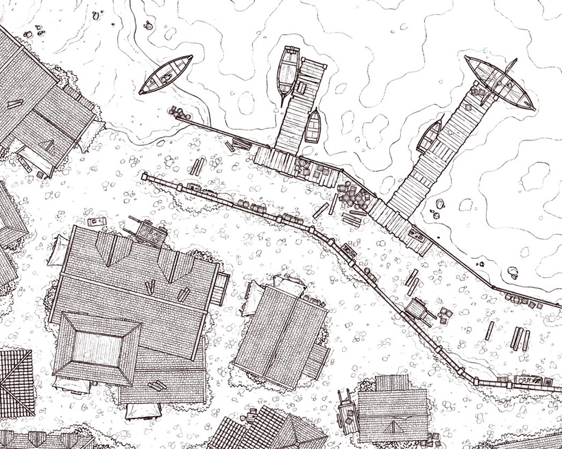
2. This is my 2nd time using the new rooftile texture I made! It still feels nice and tidy, which I appreciate, but I'm starting to feel like I should whip up 1 or 2 alternate roof types to help break things up. You'll notice that I'm still using the orange clay roofs that I think I made in 2019 for Town Street, which probably need to be quietly never used again. Yikes.
Anyway, I'm also still pretty happy with the new cobblestone style I've been using, but I'm still figuring out how much detail is necessary per grid square in order for the texture to come across. I think, for my next city map, I'll try to go a little heavier on the cobblestone details in an attempt to feel things out, but I suspect that it won't be worth all of the extra effort. We'll see!

3. Colors! I decided to try out a few tweaks to my typical city palette this time- using much more bold greens for the grass and adding a yellowish tint to the cobblestone. The yellow tint is a bit questionable in hindsight as it brings out the yellow lighting effects a little more than I was intending, but it does also feel more natural. Maybe that stays, who knows.
The new direction for the greens was almost certainly a mistake, but they really do stand out more I suppose. I don't know. This is one of those things I'll have to make a decision about later once I get fresh eyes on it.
Files
