Home
Home

 Artists
 Search
 Recent
 Random
 Posts
Posts
 DMs
DMs
 Tags
Tags
 Random
 Importer
 Import
 FAQ
FAQ
 Account
 Register
 Favorites
 Login
Login

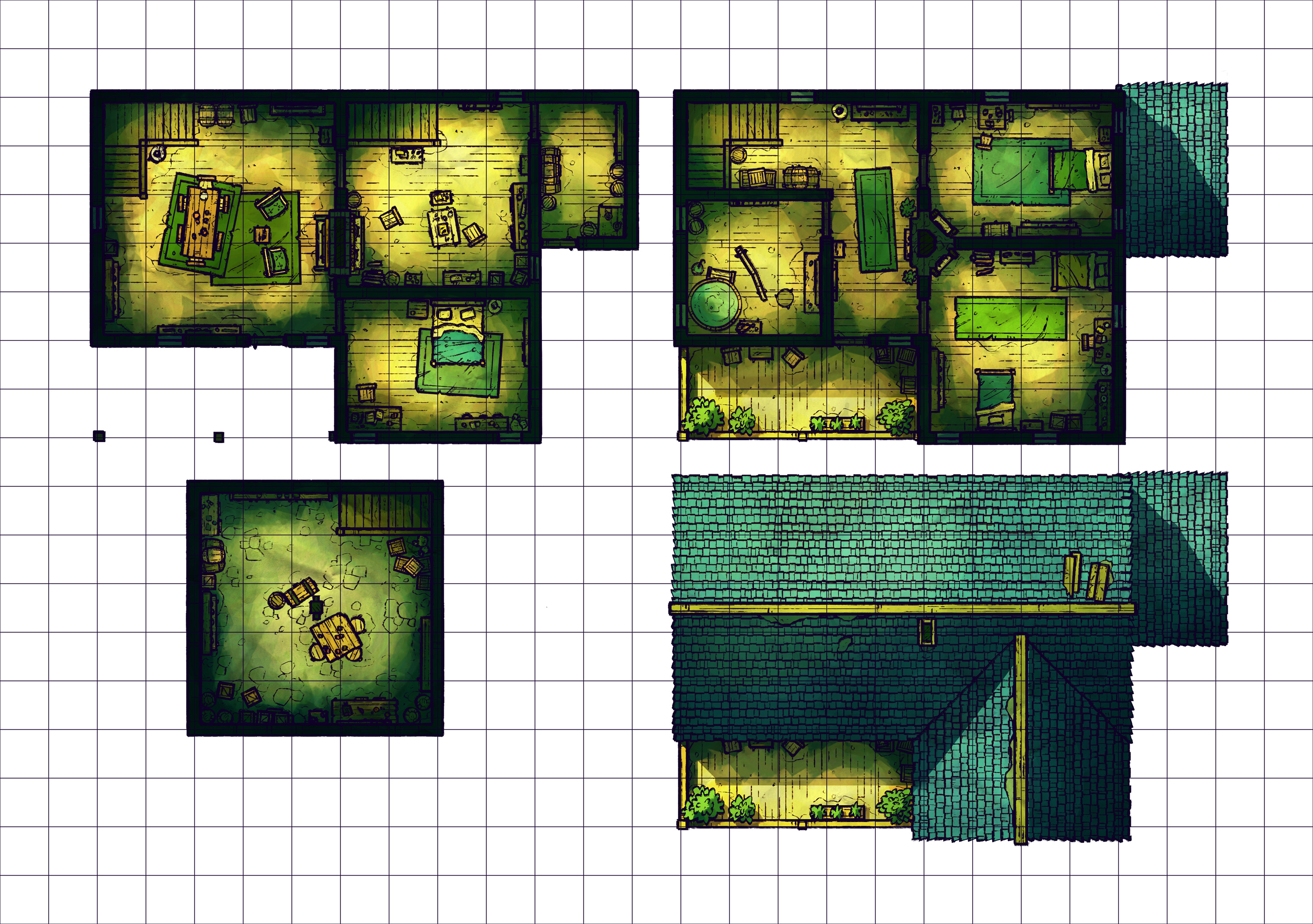
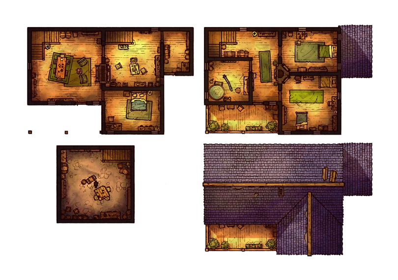
Cozy House, Adept (Patreon)
Downloads
Content
Hello Adepts! The map this week is the Cozy House (27x19), a small and simple building with little more than some bedrooms, a cellar, and a kitchen. I might have been tempted to add lots of other interesting rooms and props, but as always I'm dedicated to making maps that aren't so specific or limiting that you can't use them without explaining away aspects that don't add to your campaign.
Your alternate version for this map is another Spooky one, a setting you can expect to see lots of in the next month. Since I'm planning on making lots of City maps in the coming weeks, I suppose you Adepts specifically will be getting the spookier versions, since it would feel a little unusual for the basic version of a city map to be particularly spooky. We'll see though! Maybe one of them will be a city's cemetery or something?

1. Gosh, I really just dislike designing buildings. Interior design just isn't my forte or my passion, but in this biz you gotta take the plunge every once in a while. So, I started off with a fairly basic building layout, with the central point of the house being a fireplace. Again, I don't know the first thing about architecture, but it makes sense to me that the fireplace would be in a central location so that it might heat the rest of the house efficiently. With that in mind, I also added some extra smaller fireplaces to the 2nd floor- in a way which hopefully doesn't betray my ignorance about the design and proper placement of fireplaces and chimneys.
Otherwise, the rest is somewhat straightforward design. I like to add outdoor areas to the 2nd floor of buildings as a way to offer some verticality to the structure of the building, in hopes that crafty players can feel rewarded for scaling buildings, or perhaps as a way for the residents can keep an eye on things happening outside.

2. It seems like I'm making a lot more new props these days than I used to, likely because I'm starting to feel a little tired of some of the older props which I've used to death. Not that that's stopping me from reusing old props as much as possible, but you get the gist.
As I mentioned in the last Behind the Scenes post, I've been working on drawing up some new rooftile textures, to replace the current one which I've been using for something like a year now. The biggest difference I'm aiming for for Roof 2.0 is thinner and cleaner lines, featuring fewer eye-catching details and repeating patterns. I'm sure I'll be the only one to really notice or care about the difference, but at the end of the day my opinion is usually the harshest one I have to deal with.
3. For this map I started with the lighting effects which I used for the Village Gate map and scaled them back, dimming the lighting until I had a nice starting point to shade the rooms in. As always, the way I like to do this is by beginning with roughly placed shadows around the walls and the floor near the props, which I then chip away at with a pretty crunchy eraser, giving a little bit of detail to the shadows in a way that feels grimey. With that finished, a softer brush adds a bit more depth to the deepest part of the shadows, and another soft brush adds bright orange/yellow to the center of each room as the highlight. This gives the impression of some lighting in the room without getting in the weeds with setting specific light sources from which I would need to establish proper shadows from the props.
I know that most people don't really care about having realistic lighting inside of buildings, instead looking for clarity and readability, so I try not to get too caught up in that sort of thing. Rather, I get to go nuts on the roof view, which helps me feel better about skimping on proper lighting inside.
Files