Home
Home

 Artists
 Search
 Recent
 Random
 Posts
Posts
 DMs
DMs
 Tags
Tags
 Random
 Importer
 Import
 FAQ
FAQ
 Account
 Register
 Favorites
 Login
Login

Town Hall, Adept (Patreon)
Downloads
Content
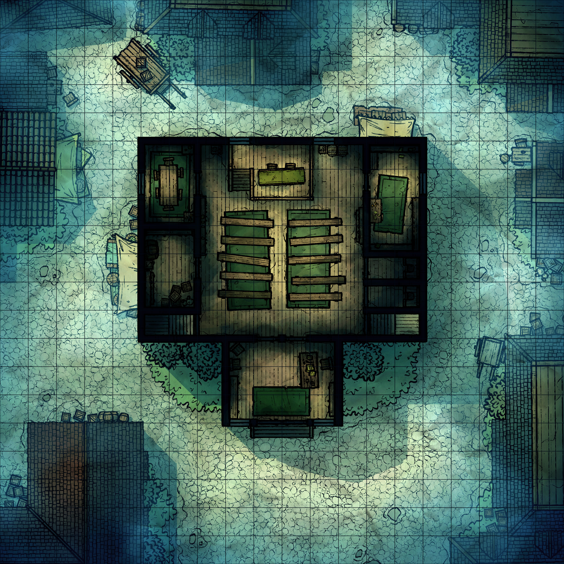
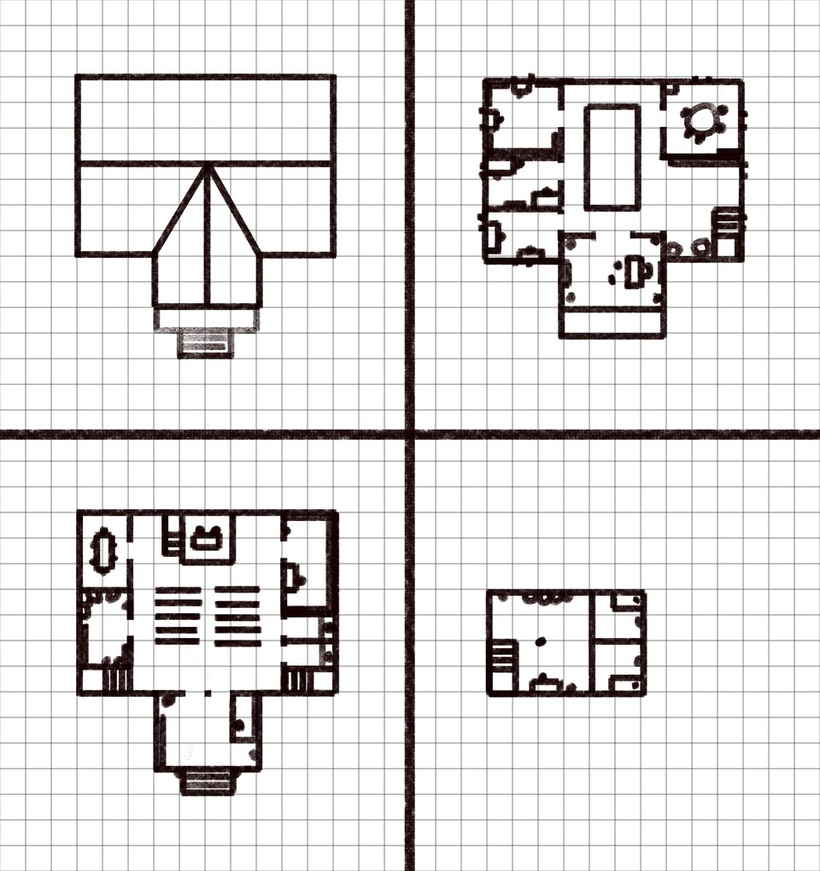
I'm back again with a fresh building map, the Town Hall (20x20)! Wow, it's such a pain to make maps with multiple levels! I usually like to keep my Photoshop layers pretty straightforward, which is just about impossible when you have 4 levels of building to keep track of. It could have been a lot easier if I had decided to scale back this map in a couple ways, but I felt I'd be doing it a disservice if I didn't go as hard as possible on it.
Also, your extra version of this map is a particularly foggy one- which I made with Brandon Sanderson's 'Mistborn' series in mind. I don't know if anyone out there is actually playing a game set in that universe, but if so this one should do the job nicely! Otherwise, it's more than good enough for a Curse of Strahd campaign, of course.
Anyway, let's chat about it.
1. So, the deal with this map is it's a fairly straightforward city hall, nothing too crazy. In Rime of the Frostmaiden there's a fairly fleshed out city hall map which my players had spent some time in and had left me with a pretty good idea of what kind of props and rooms I wanted to include. I decided to go a little small on the design and layout, mostly emphasizing the gathering hall as the focal point of the building, which worked out since I could barely think of props to fill the place with as is.
As you can see, my original plans for this map didn't include anything outside, just blank space. I was intending on doing something similar to the Grimy Inn, which was just a building with a bit of cobblestone outside the walls to help set the scene somewhat without me having to flesh out a street and alleys. However, once I had finished working on all of the building's outlines (yesterday afternoon, yes I was already behind schedule) I realized that this map would be a little bit lackluster without some extra trimmings. Thankfully I've gotten pretty damn fast at whipping up quick urban landscapes, so I quickly snatched up roofs and props from several of my other city maps and slapped them together, giving enough room around the Hall itself so that there's room for carts to slip by.

2. Once again, I'm very happy that I had put in the effort of gathering the line art for a huge number of props I've previously drawn, it's made this process much easier. Even without drawing everything fresh, I have a hard time layout out props and rooms, it's so tricky to place all of these things in a realistic way that both expresses the function of the room and makes for interesting levels to potentially fight through. Honestly, I don't have much to say here, buildings are a huge pain and it's no wonder why I prefer making forests.

3. Forgive the watermarks, I made this layout to post on social media and I had forgotten to make another to post here without them.
As far as colors are concerned, I decided to go with a palette somewhat similar to the Shady Brewery, which was nice and vibrant despite being a wooden building filled with wooden props. I think the secret is to start with somewhat dark orange floors and then flesh them out with a pleasing array of shadows and highlights, which gives each room a very satisfying feeling of depth.
Thankfully this palette works perfectly alongside my regular city palette as well, so I could overlay color effects on top of everything at once instead of creating nested effects for each floor. If I was a smart artist I wouldn't lean on layered effects, but rather color everything right the first time, but I'm lazy and this usually gets the job done just fine.
Files