Home
Home

 Artists
 Search
 Recent
 Random
 Posts
Posts
 DMs
DMs
 Tags
Tags
 Random
 Importer
 Import
 FAQ
FAQ
 Account
 Register
 Favorites
 Login
Login

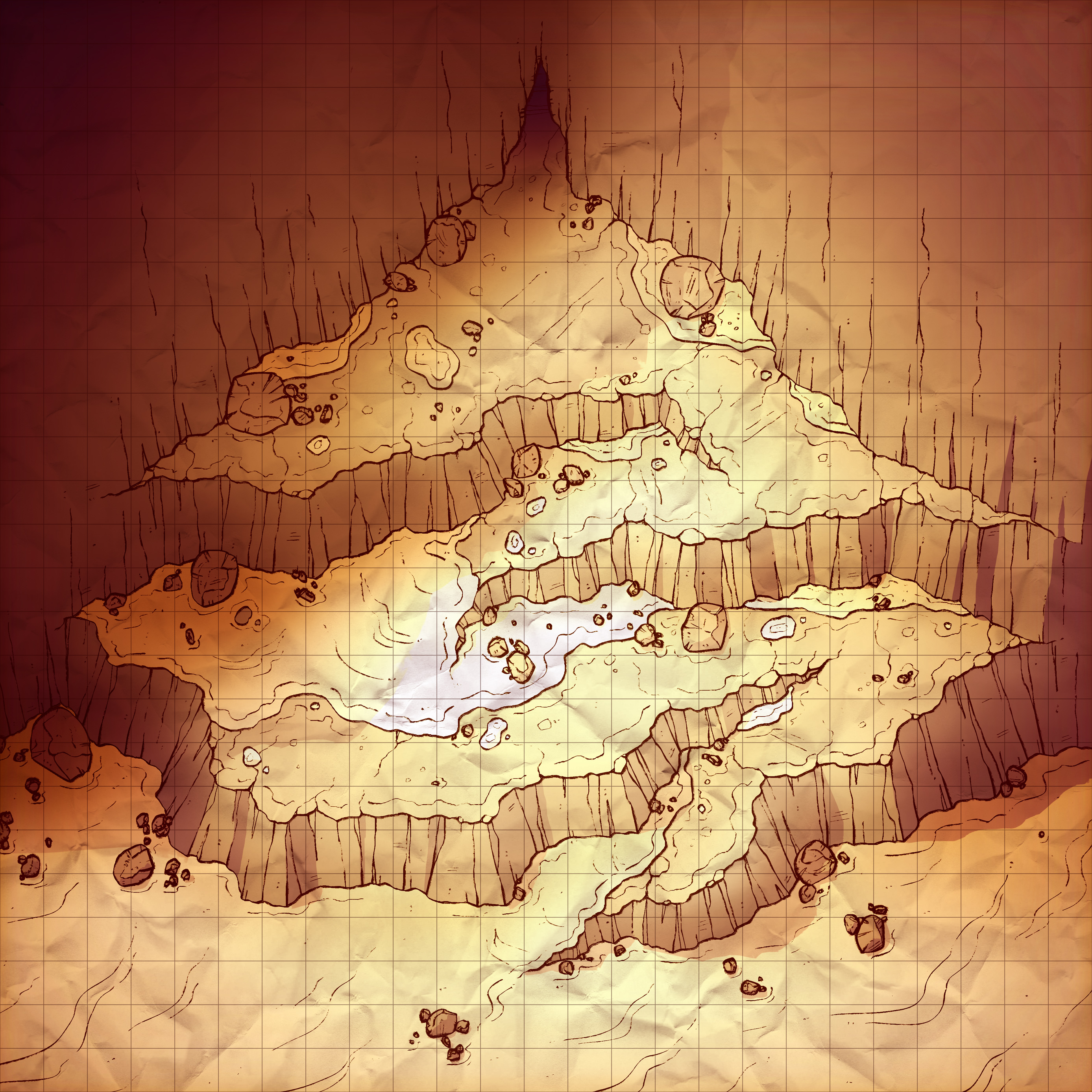
Frozen Ascent, Adept (Patreon)
Downloads
Content
Hello folks! This week I made the Frozen Ascent (25x25), and you're in luck because I also whipped up an alternate desert version as well! It seems like people are ravenous for more desert maps, and I think this is the best way for me to make some more for you while also satisfying those people who are hankerin' for winter maps. Cheers!

1. Strangely enough, I actually had to go through a lot of revisions when designing this map. I have a very strong memory when it comes to maps I've made before, which is helpful for ensuring I don't retread ground with any maps, but I can't help but compare maps that feel similar in my mind but not so much in reality. So, when my first couple sketches seemed way too similar to the Mountainside Trail, I knew I'd need to make some revisions.
In the end, I was slowly falling so far behind schedule that I decided to simplify the design as much as I was comfortable with, which was probably the correct decision since the design I had was likely way over-complicated. This current layout is a little plain, but with a nice parity between open spaces and tight ramps that overall feels balanced.

2. This time around, I started the map knowing I wanted the 'rock walls' to feel more like ice ledges, which meant that the way I usually draw them would be a little too rough and scratchy. To better capture the slick and icy feel I wanted, I cut out the contour lines and other small hash marks and instead leaned more on smooth/wiggly vertical lines. While it might have been better to go heavier on smooth, flowing lines for this map, I wanted to make sure I didn't need completely redraw them for the Arid version (as mentioned in step 1 I was already falling behind schedule), so I felt a half-step between the two would be a decent compromise.

3. I strayed from my usual style in several ways when coloring this map. Firstly, I left out the vignette (the darkening around the edges of the map) altogether. While it might have been nice to have the vignette adding some interest to the bottom of the map, I liked the cleanness without it. Also, I kinda felt that its absence helped express the openness of the location, giving a feeling of open space off screen. That could just be in my head though, but I'm used to overthinking things like this.
Secondly, I took it easy on the 'glare'. Normally I'll paint everything with very subdued colors and then layer effects on top which brighten, saturate, and boost the contrast in such a way that gives everything a vibrant and satisfying glow. And, between the effects and the colors I'll place the glare (as well as the shadows), which adds a lot of atmosphere and ties the map together with uniform lighting. This time, I decided to simply brighten the map in the effects group, instead using the glare to add some glow to certain points in an attempt to stress changes in elevation. The effect is more crisp than the ambient light in my other maps, which is fun here but not always the correct move, so we'll see if I try this again somewhere else.
Thirdly, I took it easy on the crumpled paper texture. Again, this helps stress the crisp and clean colors/lighting, which was what I wanted to chase with this map. A very simple change, but it felt like the right move. I don't plan on making a habit of laying off of the crumpled paper, since I'm a fan of how it adds background detail to otherwise blank space (which saves me a ton of time), kinda like adding greebles to a model.
Files