 Home
Home

 Artists
 Search
 Recent
 Random
 Posts
Posts
 DMs
DMs
 Tags
Tags
 Random
 Importer
 Import
 FAQ
FAQ
 Account
 Register
 Favorites
 Login
Login

Feywild Encampment, Adept (Patreon)
Downloads
Content
Did you like the regular version of this map (30x30) but hate that dang camp right in the middle? I get that. Now you can just hang out in a forest with just a whole bunch of mushrooms and rocks, and no one will be around to ask you what you're doing! And, of course, this one comes with a night version, because sometimes you mess up your schedule and end up in the forest at night.

1. Forests, right? I think that fey maps should be mostly vegetation, and this one is no different. The only big change I made to the formula this time is I wanted there to be large tree canopies on the edges of the frame which will help give the impression of a thriving forest extending in all directions. And, while I was at it, I figured it was about time I draw some fresh trees- I had been using the same batch of ~15 for some time and I was starting to recognize a few on sight.
Anyway, my concern with making even larger trees was that it will make navigating the map more difficult since even less of the ground would be visible. At some point, you reach critical mass with too many trees and not enough actual visible terrain. However, DMs are more capable than I often give credit for, and it's easy enough to just say that the trunk is in the center of the tree and everything else around it is open forest floor.
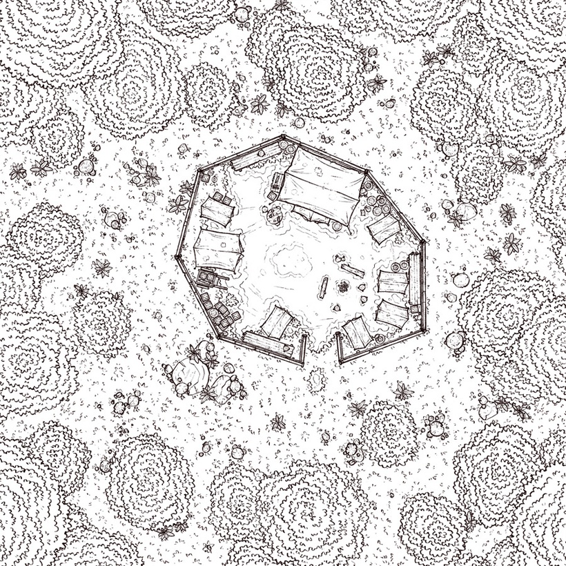
2. As I mentioned, I drew new trees. I found that the old batch I was using had unusually heavy outlines compared to my other props, maybe 3 px thicker, which might have been intentional to help them stand out from the ground, but these days I think that coloring and lighting can do the same job and be more uniform. I often notice this sort of thing in art I see online and it usually bugs me- I prefer outlines to be just about the same size, and any huge variations strike me as feeling messy and overly eye-catching.

3. I decided to go a little more extreme with the colors than I had with previous Fey maps. I like the palette and effects that I've used previously, but I wanted to see if I could enhance the magical vibe with even more exaggerated levels and contrast, in addition to heavier purple and pink tints.
I'm still not too sure yet whether these changes were an improvement, but it's definitely more eyecatching (in a good way), and I think the colors are even more satisfying than before. I'll know in a week whether this is something I'll imitate for the next one, but my inclination right now is that the trees and grass look excellent while the rocks, dirt, and mushrooms will need more experimentation before they feel right.
Files
