Home
Home

 Artists
 Search
 Recent
 Random
 Posts
Posts
 DMs
DMs
 Tags
Tags
 Random
 Importer
 Import
 FAQ
FAQ
 Account
 Register
 Favorites
 Login
Login

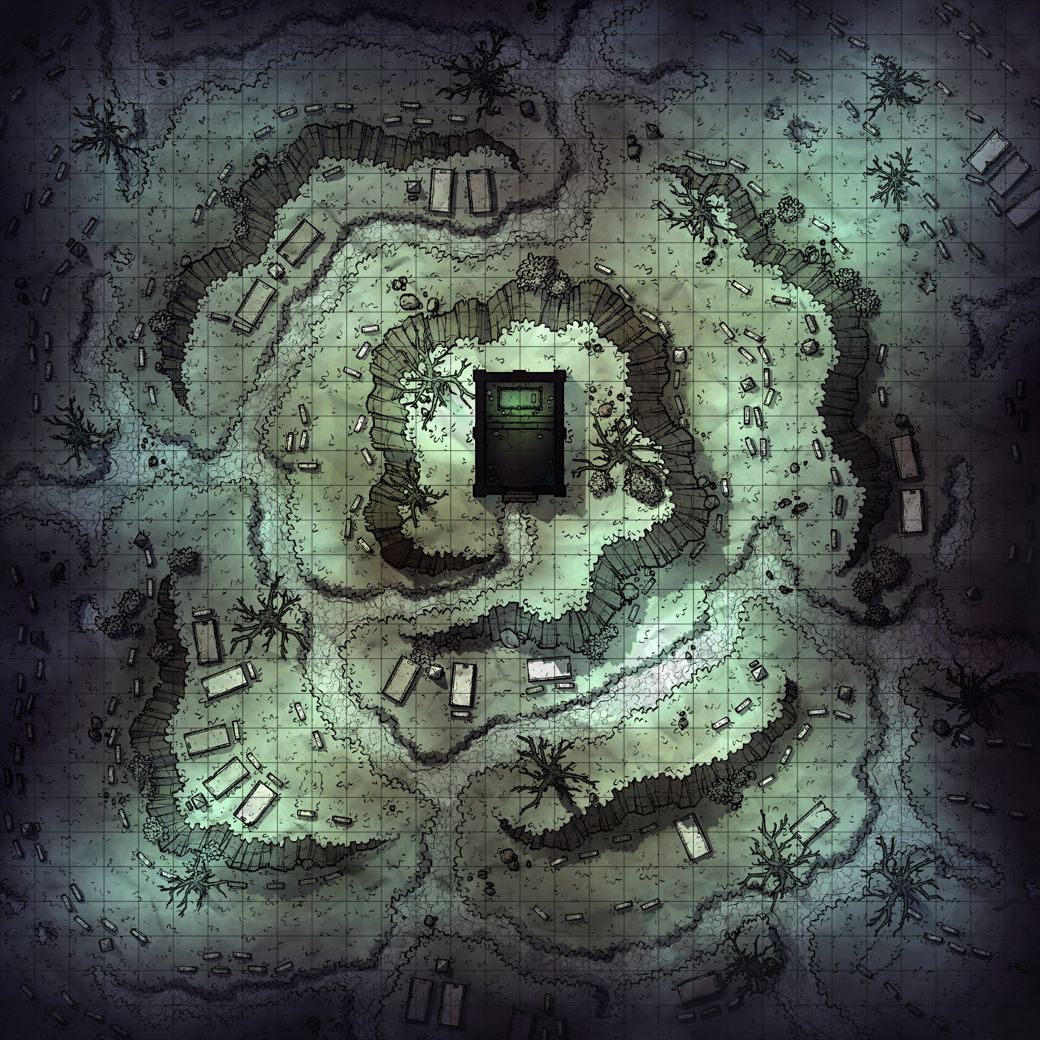
Misty Graveyard, Adept (Patreon)
Downloads
Content
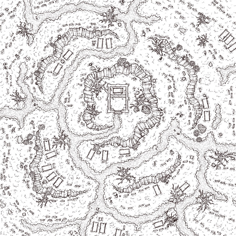
Hello, Adepts! This week's map is the Misty Graveyard (30x30), and your alternate version is a more subdued version, which I thought was fitting. The basic version feels very spectral and spooky, but that's not always the right vibe for a graveyard- for this one, I tweaked the colors and lighting for a more stark and grim feel that would fit perfectly in a setting like D&D's Shadowfell plane. Additionally, I cut the misty effects down to keep the edges of the map from being lost in the darkness, a change that I thought cleaned up this version and helped set it apart from the basic one even further.

1. Starting off with this sketch, I liked the idea of a dramatic graveyard scene with a lone mausoleum backlit by the moon, overlooking an overbooked cemetery which seemingly is laid out around it. I thought it sounded like a fun concept to build an encounter around and also versatile enough to be useful for anyone who needs a multi-purpose graveyard map. The tiered layout also felt like a neat addition to a graveyard map, perhaps it'll inspire some spooky scenes with zombie hands reaching out of cracks in the rock walls to grasp at players taking cover.
2. For whatever reason, I started this map filled with enough energy to whip up some fresh rock walls. Typically I'd begin by searching through my library for ledges with approximately the right size for what I need and alter them to fit the space, but I had a hunch that I wouldn't find quite what I was looking for and eventually I'd have to just draw them up fresh anyway. The gravestones and sarcophagi are largely taken from old graveyard maps, though with lots of tweaks where it felt that some more variety was necessary. I probably should have made a few more varieties of gravestones to help it feel more realistic, but at the time I felt that it wouldn't have added very much to the map and I left it alone.

3. I had a hell of a time with the colors, spooky maps can be a real pain sometimes. For these kinds of maps I really want to lean into the eerie lighting, maybe with some spectral effects, but that doesn't really read well when you're making it bright enough to pass as a 'day' version. My first attempt imitated the colors and lighting of last week's Spooky Swamp, but after a little while I realized I didn't much like the way I colored that one anyway, so I started over. This one is sorta a half-way between Misty Boneyard and Witch's Ruins, which were both close to what I had in mind for this map- eerie and maybe supernatural.
Honestly, I don't know what I'll do for my next spooky map. This one's colors and lighting probably wouldn't be right for any other spooky map, which is a shame since I typically make a solid attempt at making maps with similar environments have matching palettes. Unfortunately, I have yet to make a scarier map with a palette I'm particularly happy with, so it'll probably be some time before I settle on something I like.
Files