Home
Home

 Artists
 Search
 Recent
 Random
 Posts
Posts
 DMs
DMs
 Tags
Tags
 Random
 Importer
 Import
 FAQ
FAQ
 Account
 Register
 Favorites
 Login
Login

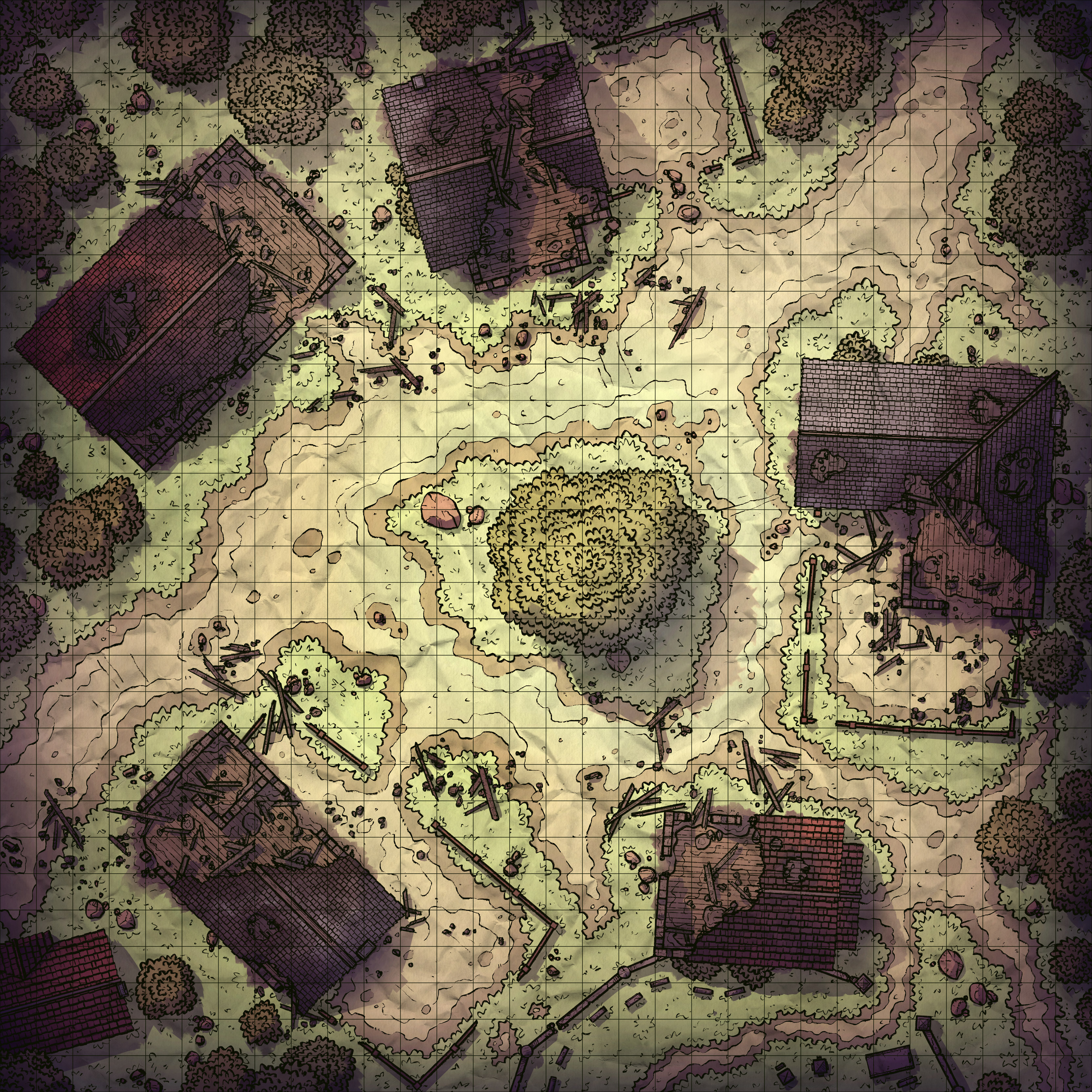
Ruined Village Center, Adept (Patreon)
Downloads
Content
Hello Adepts, this week's map is the Ruined Village Center (30x30), and your alternate version is a handy Subdued recoloring! When it comes to more 'grim' maps like this, it's nice to have less cheerful versions on hand for darker campaigns (I'm looking at you, Curse of Strahd). My typical palette often feels a little wrong for those settings, so I think I'll try to make more of these versions for a while, especially considering I'll be making several maps that will fit that environment in the coming weeks.

1. I've noticed recently that my 'Village' maps (grassy farming towns) tend to feel a little too similar to each other. I'm not very sure how to avoid this though. I like how they can be used side-by-side as parts of the same town, but at a glance, they're hard to differentiate from each other. When the time comes for the next one, I'll have to see if I can make it particularly unique from the rest of the lineup. Maybe it'll have some recognizable buildings or unusual terrain for a village- something like the little waterfall cutting through BotW's Kakariko Village, or an ancient stone bridge leading out of town like Skyrim's Dragon Bridge.

2. As you might expect, I tried to reuse as many chunks of the Razed Street as possible in order to save some time. Unfortunately, I eventually decided that a lot of the ruins are a little too easily-identifiable for me to bring over wholesale, so I set out to rough them up and mix-and-match a few parts in order to make them feel more unique. Along the way, I learned a thing or two that should help make 'ruined' maps a little faster to make in the future! Fast enough that I can make one as a Revisited map? Probably no, but it's not that far off!

3. I've never been a fan of my Village coloring and lighting. I can't resolve how vibrant I want the environment against how muted I want the roofs to be; no matter how I re-balance the lighting I haven't found something that I'm happy with. This version isn't much different- the grass is great by itself but with the village props, it feels extremely wrong. Anyway, I colored this one to be very slightly more mono-tone than I would have otherwise due to the burnt-out buildings, so it's not a great one to be using an example for my usual palette.
Files