Home
Home

 Artists
 Search
 Recent
 Random
 Posts
Posts
 DMs
DMs
 Tags
Tags
 Random
 Importer
 Import
 FAQ
FAQ
 Account
 Register
 Favorites
 Login
Login

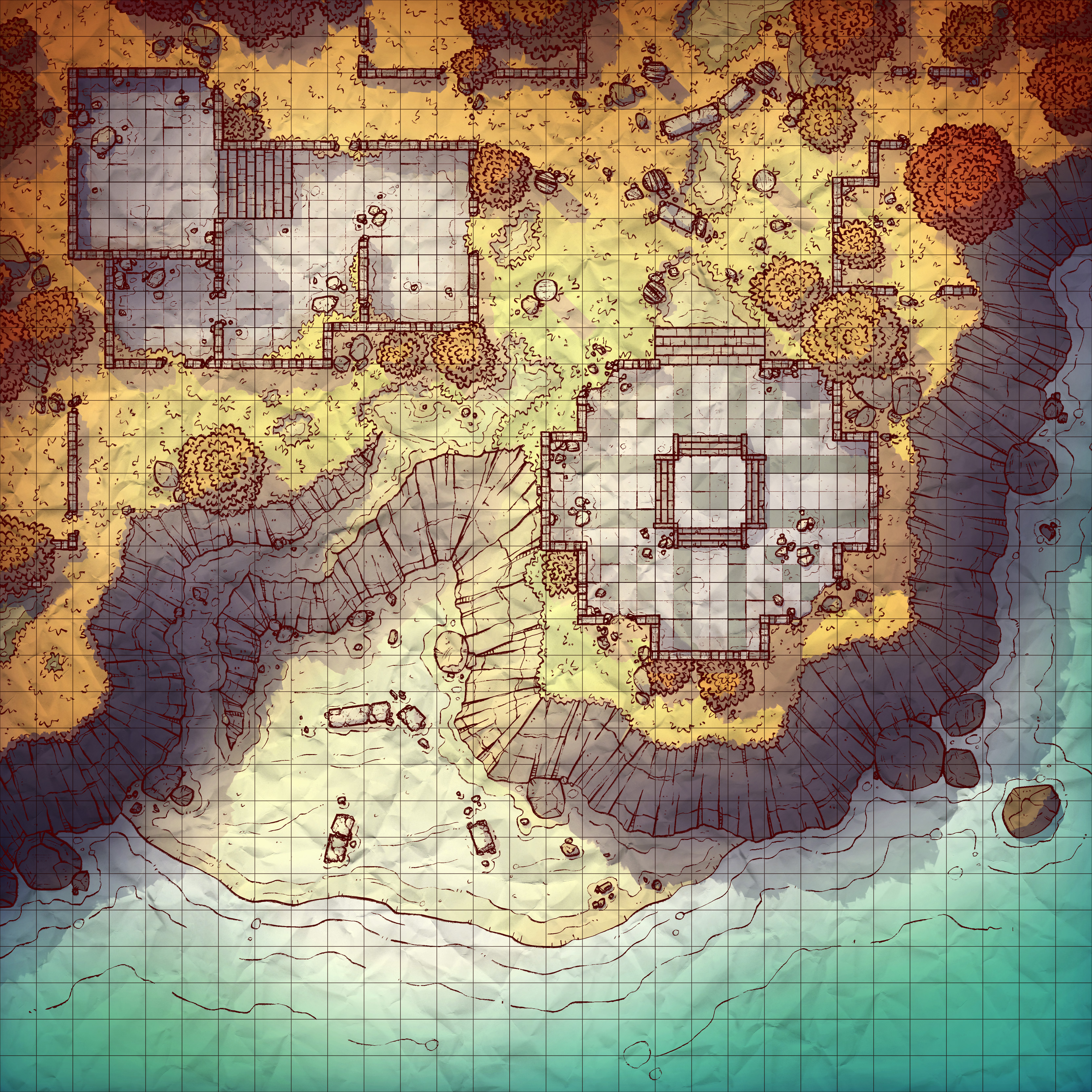
Oceanside Ruins, Adept (Patreon)
Downloads
Content
I'm back this time with the Oceanside Ruins (30x30), a dramatic location that is probably located just a little ways away from the Cliffside Ruins map I made two years ago- though I can't say you could seamlessly transition from one to the other.
Your alternate version this week is another Autumn recoloring, which was prompted by a recent request! I'm not complaining though, I really like this palette, it makes for a very different vibe than the original. And, of course, it comes with a night version as well!

1. So, the original plan for this map was for a bunch of ruins half-covered in sand on the beach, which was kinda fun but a little boring. I don't think that sand makes for particularly interesting terrain, and the end result for that idea would be almost entirely beach, maybe with a few palms for color. Instead, I liked the thought of a small cove among the crumbled remains of some old structures, which would provide plenty of cover and multiple levels of terrain.

2. I'll tell you what, I've made a lot of use out of that 5' tile floor texture in the couple weeks since I've made it. This time I tried something I've been a little hesitant about, a shrunken tile pattern with 4 tiles per grid square. The major issue with this is how the tile lines hide the grid, and I thought I could negate that by lowering the line opacity and doubling up on the grids that overlap them. Looking back, I think that no matter how transparent I make the 1/4 grid tiles, they will still confuse the eye and make you think twice about any movements made on them. I don't think I'll be doing this again.

3. This time around I tried to take another stab at revising my old palette- I last tried this for the Forest Pond map with mixed results. I changed much less for this attempt, tweaking the grass, rock, and tree colors slightly to (hopefully) mesh together better. I've put much more time into coloring this map than I typically do, with 3 other ~slightly~ different palettes, and I'm still not completely happy with it yet. Not that I think it looks bad, but it certainly could be better. If I had more time I'd delay its release for a few more days so I could really dive deep into it, but here we are.
Files