Home
Home

 Artists
 Search
 Recent
 Random
 Posts
Posts
 DMs
DMs
 Tags
Tags
 Random
 Importer
 Import
 FAQ
FAQ
 Account
 Register
 Favorites
 Login
Login

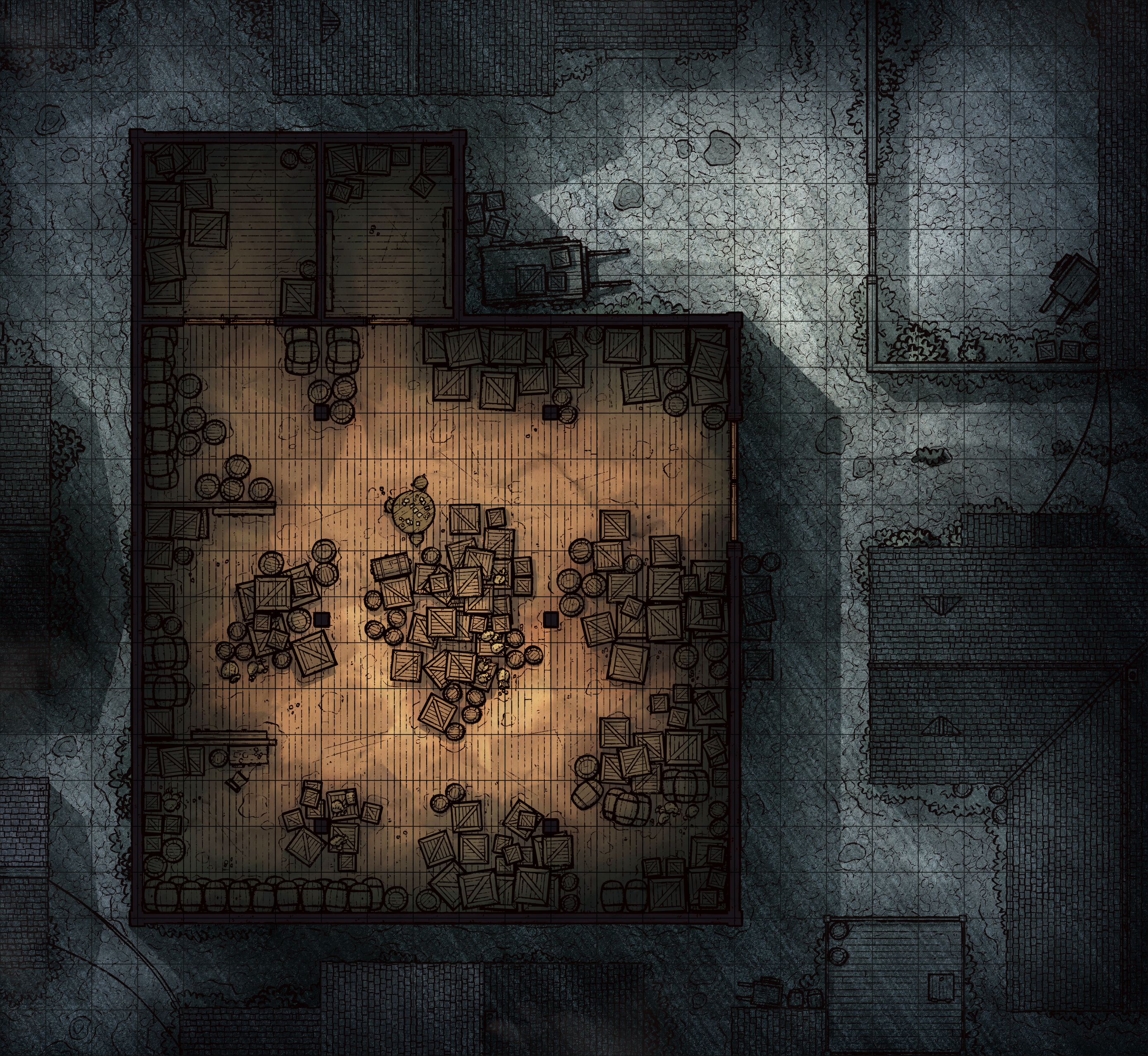
Cluttered Warehouse, Adept (Patreon)
Downloads
Content
Hello Adepts! This week's map is the Cluttered Warehouse (25x23), and your alternate version this time is Stormy! I really like the colors in this one, the interior really pops in contrast to the gray and bleak outside. I always like stormy maps because they add a nice twist to how it plays out, specifically this time I could see my players trying to use the noise from the stormy to their advantage, maybe trying to time their breaking-and-entering with thunder to gain entrance without being noticed.

1. The thing about warehouses, I discovered, is that the good ones are probably just filled with neat rows of crates, which I decided was a little too boring for my taste. Since I've already declared that this would be a 'cluttered' warehouse, I felt that I could make the place as much of a damn mess as would make it interesting, with crates just sitting around in big piles with barrels mixed in for fun.
The outside wasn't supposed to be too terribly interesting. I didn't want the frame to get too far away from the focus of the map, the warehouse, so I couldn't add much more than about 1/2 of any buildings. I mostly wanted there to be a little context for this map, because I imagined the kind of stories and encounters that might come from a map like this and I felt they all required the surrounding area to be laid out to some extent.

2. I finally decided that it's time I redraw some of my favorite assets- rooftops, crates, and barrels. Crates/barrels are a consistently solid prop, filling up space in most maps with anything at all without catching the eye, though this time they had more of a starring role. The old buildings I had been using were a little too messy as well as too eye-catching, I needed them to give the impression of a rooftop without overcomplicating the space with an excess of lines.
Thankfully I planned ahead and isolated my new cobblestone texture before I got around to accidentally destroying it. I drew it for the Rocky Harbor map for the sake of my sanity (the old texture had the barest hints of grid lines from when I tried to make it tileable), and it has already made my life much easier just having it on hand.

3. Surprisingly I had some trouble coloring this map. Typically city maps are a piece of cake, the shadows are isometric and the lighting is straightforward, but I had difficulty working around the giant warehouse in the center while retaining my typical shading style. I'm still not too content with how it turned out, but with my rapidly developing cold, I had to draw the line somewhere. Speaking of which, I'll be laying down now.
Files