Home
Home

 Artists
 Search
 Recent
 Random
 Posts
Posts
 DMs
DMs
 Tags
Tags
 Random
 Importer
 Import
 FAQ
FAQ
 Account
 Register
 Favorites
 Login
Login

Rocky Stream, Adept & Expert (Patreon)
Downloads
Content
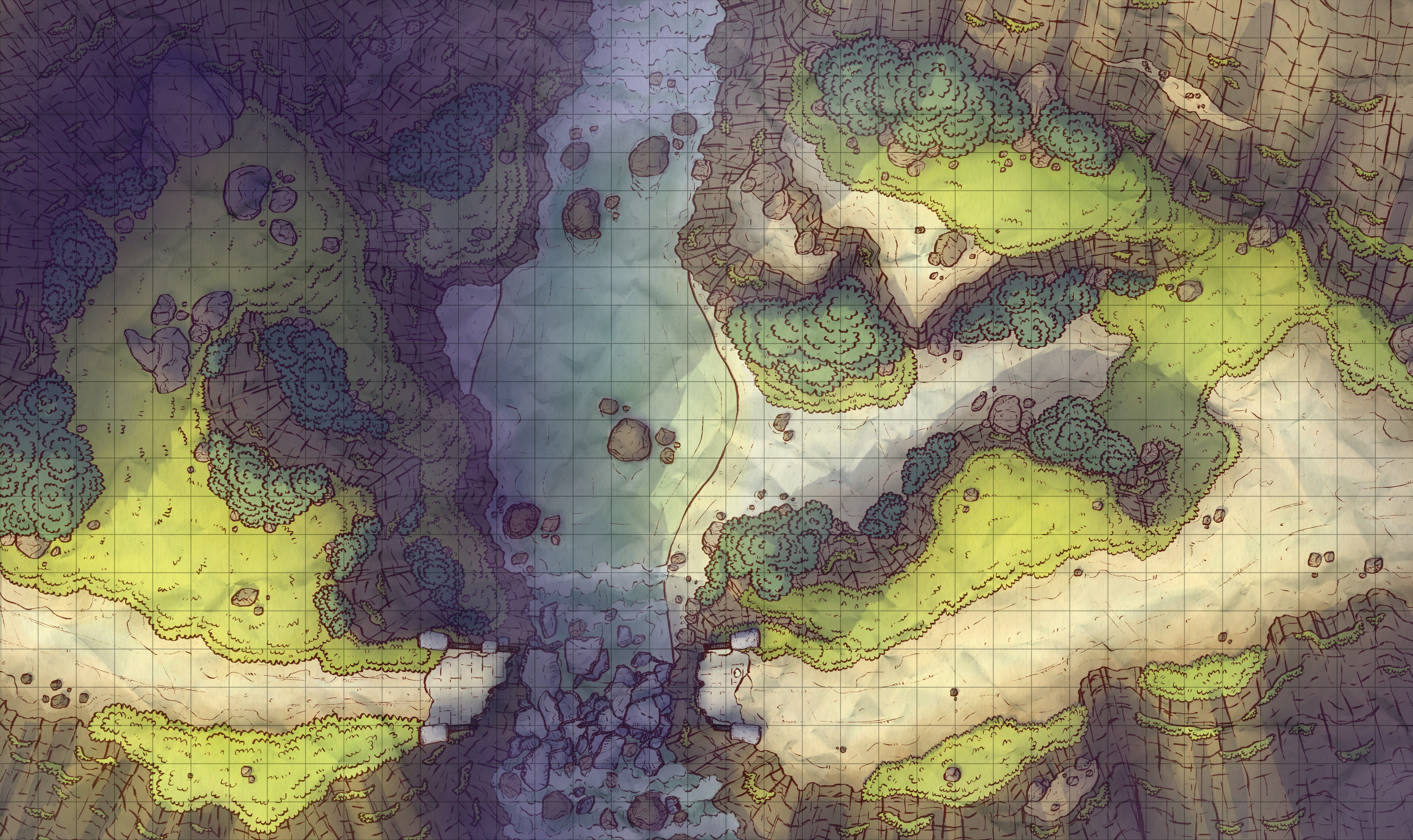
As you can see above, the Adept version of the map is a vision of a bleak bridgeless future. Your players will have to be crafty crossing now, using resources to easily cross above or else braving the swift waters below (I hope there aren't quippers down there X_X).
Anyway, let' talk about the map!

1. As you can tell, things stayed more or less the same from early on. There's an extra bush here or one less bush there, but overall I didn't have any major revisions.
I gave up on a little alternate route on the right side however. You know the little sandy path between the rocks? The two points above and below where the rocks draw near were supposed to hang over the sand originally, ideally a gap just big enough for someone to jump. I was struggling to make it obvious that they hang out over the sand, and after a few tries I called it quits. It still looks fine, but that's an effect I'll have to try again another time.

2. Outlines! This one didn't translate as well to outlines as I would have like (a little bit too messy). The new brush I've been using looks great by the end of each project, but this stage never looks as nice as I would like. What can you do, right?
You might have noticed that in the rough sketch I drew some of the trees as palm trees, or just as big fronds. I haven't found a way of drawing those yet that I like, so I'm sticking to semi-tropical maps for a little while rather than full tropical. I'll find a satisfying way of drawing them sooner or later so don't be disappointed if that's what you want to see :)

3. I messed around for a while with the color palette here. I like yellow-ish grass, but I originally wanted to make this one more jungle-y. A more all around green palette didn't feel right though, so I went with more my usual style. In hindsight, my shadows aren't quite as blue as I wanted them to be either, they seem just a little too on the gray side.
I think some of my rock walls turned out looking veeeery good, especially those in the bottom right. Lookin' good, rocks.
Files