Home
Home

 Artists
 Search
 Recent
 Random
 Posts
Posts
 DMs
DMs
 Tags
Tags
 Random
 Importer
 Import
 FAQ
FAQ
 Account
 Register
 Favorites
 Login
Login

Winding Mountain Path, Adept & Expert (Patreon)
Downloads
Content
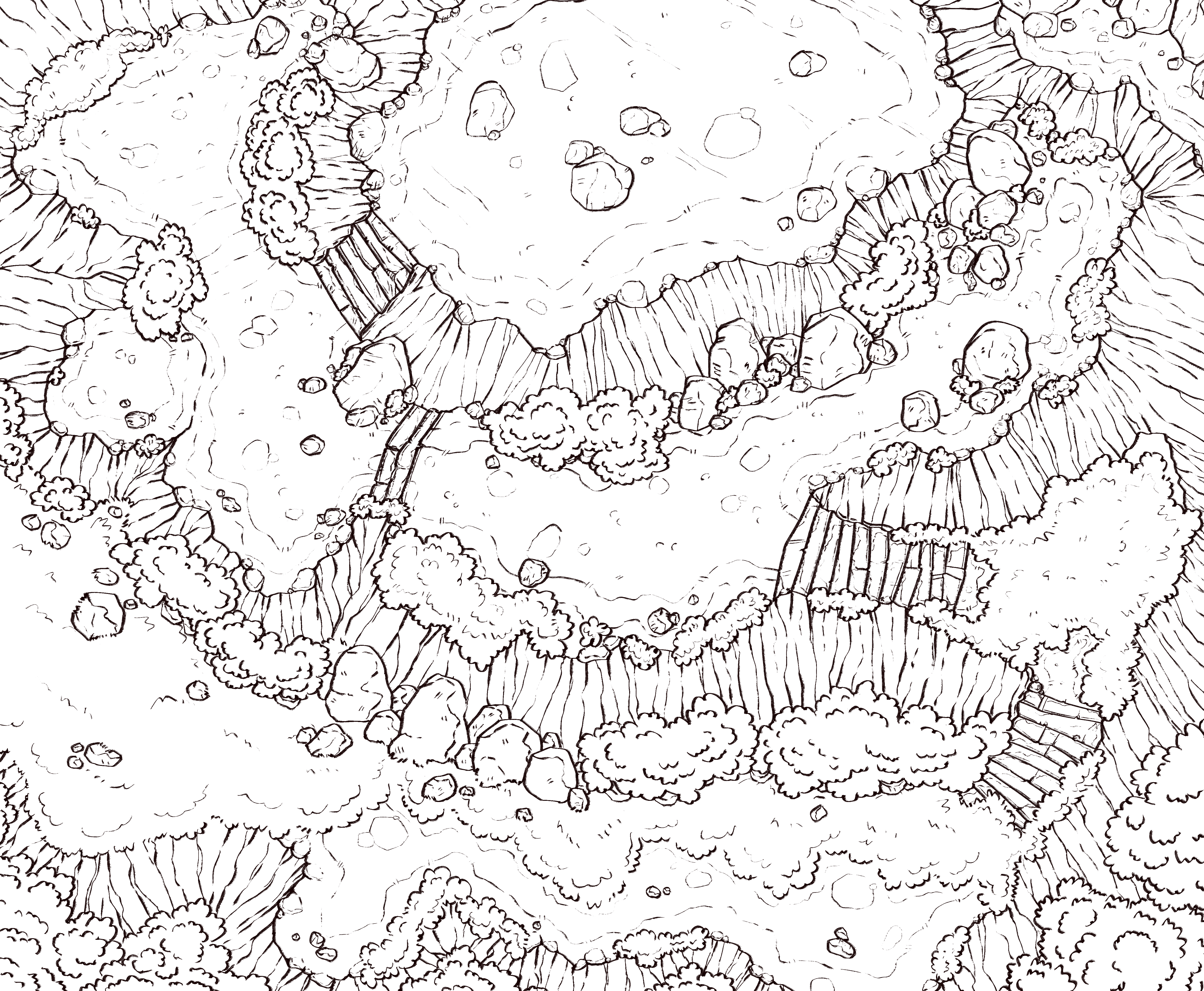
I'm back and I'm trying out new things this week! I wanted to play it fast and loose this time while messing with different styles and brushes; I think it ended up pretty rad.

1. When I know I'll be messing with elevation (more than usual), I have to add some extra details, such as shading, to help me visualize things better. I was a bit concerned that I was limiting movement too much, giving too direct of paths, but it's a style I haven't tried yet so I figured I would give it a go.
One of the players in my group is a monk who I've given gloves of swimming and climbing because he's a movement junkie and I just know he would love sprinting around this map punching shit. ;)

2. As I've mentioned, I wanted to try out a couple of different styles for this map. One of which is the brush I use for line work. I've bumped the size up 5 points and switched from a pencil-style brush to a rough bristle-style brush. The reason I've done this is I've been thinking that my lines have felt too smooth, you couldn't tell that they even had a texture (just some small wiggles, which I do enjoy); I think some texture in the lines adds a lot with little effort. I really like how this new brush looks, a bit reminiscent of the style I had in high school, but I'll wait to see what the consensus is before I use it again.
I also changed the way I draw grass for this map, a bit more fluffy. I doubt I'll stick with it however because it looks too much like bushes, so it isn't as clear as I would like.

3. Yup, gray and green. A tale as old as time. I couldn't bring myself to draw brown rocks, I'm super sick of those, so ol' reliable greige is on the menu. The green I settled with is not as subtle a color as I've been using recently (people seem to enjoy subdued colors more, who knew?) but I needed a bit of color this week to get me motivated.
I don't think I've mentioned how I pick my colors before: I google battlemaps, save the cool ones that catch my eye, and pick colors directly from them. I'm a firm believer in doing whatever works, and it works for me.

4. Oh baby, look at those shadows! I don't know about you guys, but that's eyecandy for me. I think it looks so good that I won't post it to reddit with a grid, it would cover too much. I've been making a push to use harder shadows and I think it paid off this time, the elevation really pops. My only complaint is that I made the stone ground look too smooth on the top, it isn't very natural (it's something I'll have to work on).
Files