Home
Home

 Artists
 Search
 Recent
 Random
 Posts
Posts
 DMs
DMs
 Tags
Tags
 Random
 Importer
 Import
 FAQ
FAQ
 Account
 Register
 Favorites
 Login
Login

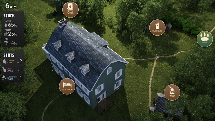
GUI - Poll (Patreon)
Published:
2021-10-20 18:27:15
Imported:
2021-11
Content
Hello everyone,
I'm currently working on the GUI for the next update. I have a few propositions for you today.
Which one is your favorite?
(you can vote for multiple options)