 Home
Home

 Artists
 Search
 Recent
 Random
 Posts
Posts
 DMs
DMs
 Tags
Tags
 Random
 Importer
 Import
 FAQ
FAQ
 Account
 Register
 Favorites
 Login
Login

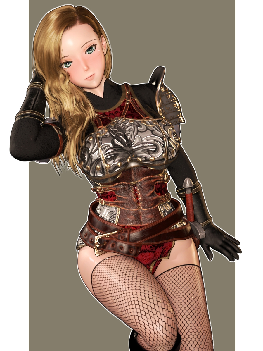
【練習CG】大尉 / [Practice CG] Captain (Pixiv Fanbox)
Content
「帝国の娼騎士」のヒロイン、大尉です。
女剣士の時と同じく、3Dモデルを調整。
筋肉など体表面のディテールを追加し、体全体と顔のラインを少しスリムに。バストを少し大きくしてみる。
(鎧を着てしまうとわかりにくいですが…)
This is the heroine of "The Imperial Prostitute Knight" , Captain.
As with the female Fencer, the 3D model was adjusted.
Add details on the body surface such as muscles, and slim down the overall body and facial lines a little. Make the bust a little bigger.
(It's hard to tell with her armor on...)
彼女についてはすでに200P以上の長編コミック作品を作っていて、描きたいことは全て描いた!という気持ちだったのですが、最近は「短編作品を作ってみるのもいいかな」と思ったり。
I had already made a 200+ page long comic work about her and drew everything I wanted to draw! But recently, I've been thinking that it would be good to try my hand at making short works.
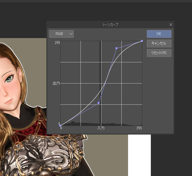
そして2Dレタッチの練習も継続。
最近始めたのがコントラストの調整。
明るい色と暗い色がそれぞれ強調されるので絵が平面的になり、結果として2Dイラスト風味が増す(ように思う)。
And I continue to practice 2D retouching.
I recently started adjusting contrast.
It emphasizes light and dark colors respectively, which makes the picture flat, and as a result, the 2D illustration flavor increases (I think).
ペイントソフト内で上のようなパラメータをいじって色味を調整するのですが、この線グラフが何を意味してるのかさっぱりわからない。完全に雰囲気とヤマ感で調整している。
だけどS字っぽいカーブにするといい感じになるのはわかってきた。
I adjust the colors by tweaking the above parameters in the paint software, but I have no idea what this line graph means. I'm adjusting it completely based on the atmosphere and the feeling.
But I'm beginning to understand that an S-shaped curve would look good.
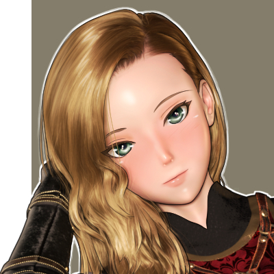
表情の描き方も色々と試してみる。
大尉のように前髪が目の一部にかかるキャラクターの場合、現実なら目が隠れる。
だけどイラストの場合は意外と、目を前髪の前に出しても違和感がないのかもしれない。(ただし、まつ毛や白目の色味を髪色に近づける調整は必要)
これはシーンによって使い分けるのが良さそうだ。
I'm also experimenting with different ways to draw facial expressions.
In the case of a character like the Captain, whose forelocks are partially covering her eyes, in real life, the eyes would be hidden.
However, in the case of an illustration, it may be more comfortable to put the eyes in front of the bangs. (However, it is necessary to adjust the color of the eyelashes and whites of the eyes to match the hair color.)
This seems to be a good choice depending on the scene.
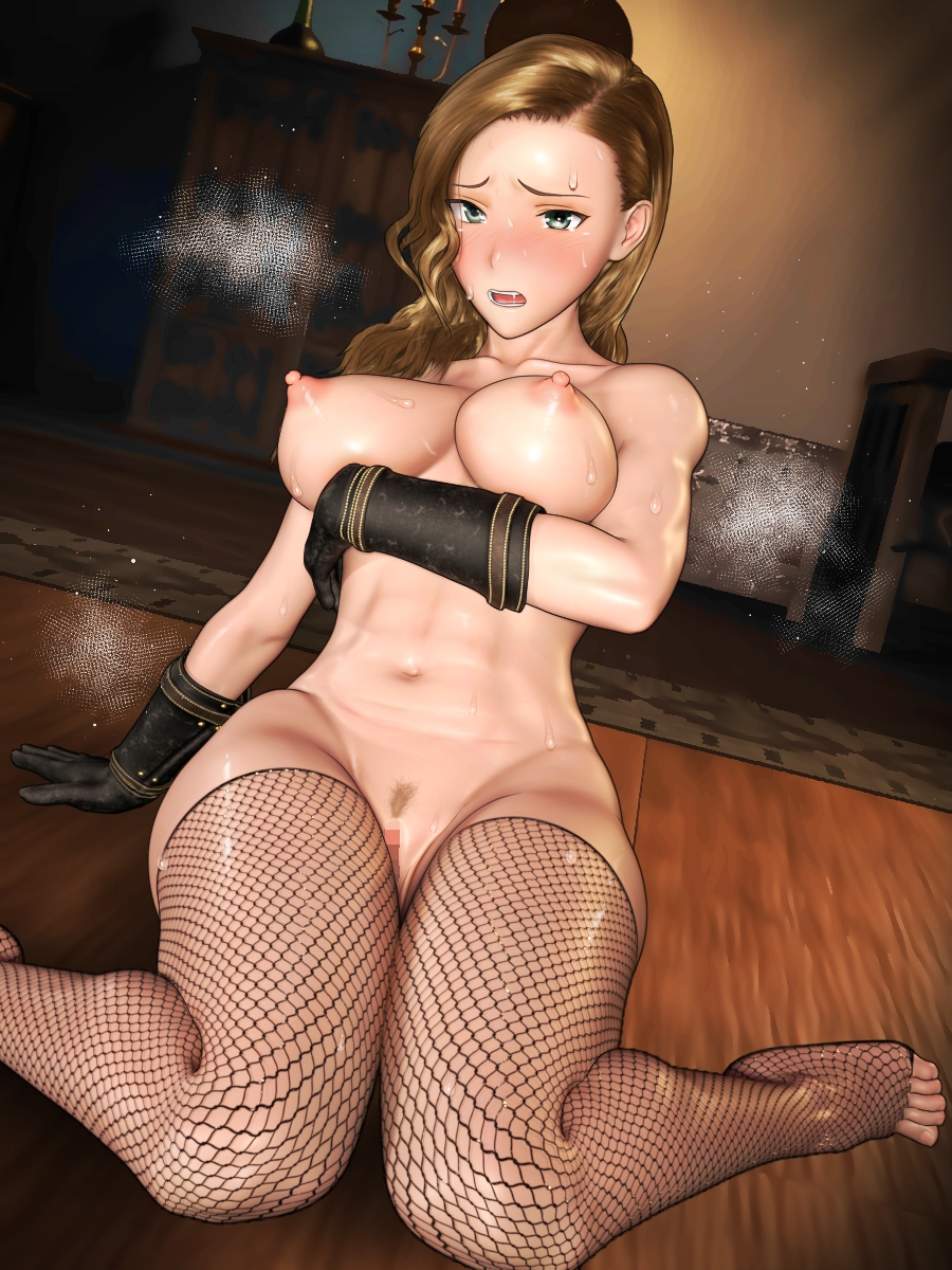
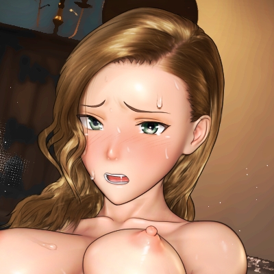
そしてエッチな練習CGも作ってみる。
And I'll try to make a sexually explicit practice CG.
今回も迷ったのは鼻の描写。
鼻をリアルに描くかどうかで絵の印象は結構変わる。
Again, what I was not sure about was the depiction of the nose.
The impression of the picture changes a lot depending on whether the nose is drawn realistically or not.
最近のイラストでは鼻を省略するのが主流なのだけど、そこはあまり気にしないでいいのかもしれない。むしろ全体のバランスが重要になってくるだろう。
エロ作品なら汗・汁・涎・その他で顔の情報量が増えることもある。
そうなった時は鼻を省略した方がバランスが取れるだろうし、一方で汗1つかいてないなら鼻を描写した方がバランスが良くなるかもしれない。
In the recent trend of illustration, it is common to omit the nose, but I may not have to worry too much about that. Rather, the overall balance will be important.
If it is an erotic work, the amount of information on the face may increase due to sweat, juice, drool, etc. When this happens, it is better to omit the nose.
On the other hand, if there is not a single sweat, it may be better to describe the nose to get a better balance.
Files


