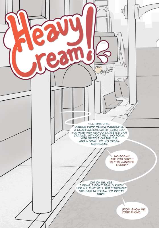
Heavy Cream pg. 1 style feedback (Patreon)
Content
Hi all, I'm looking for some feedback on the first page of the upcoming new comic, Heavy Cream. I'm looking for specifically technical and style feedback on it, as I want to try a few new experimental things with this as a kind of shake up from doing the Goobit Comic.
Black and white, manga-style colors. I specifically literally ripped these from a manga page and just added them to my palette, then did some texture work on some sections to try to smooth out the look. This isn't finished, but I want to test the waters with how this looks right now or if this is something that is of interest to you all.
Some pros and cons to this style is, I feel like my line-art is one of my strengths, but often when I get to the color step I will fuck it up and/or lack a lot of color theory skills to fully take advantage of it. With this I'd be focusing a lot of my detail work on the ink itself, and then just filling in simple colors in order to give some volume and break up repetition. Cons however is, as seen here, I'm only really using about five colors.
Limited Paneling. I'm going to be trying to do some constrained paneling, and really fix some of the granular issues with how I do my page set up. I want to clean up some of my boarders, and do more work to make my
Backgrounds. I am really bad at them. I wanna dedicate more time to learning them and making them part of the set dressing. The issue I'm facing is, I can't tell if this is enough itty bitty granular details in some of the work- the sidewalk, the windows, the street, the bench, etc, or if I should try to hone it more or even reverse and just keep it clean and readable.
Some feedback that I'd appreciate:
- What do you think of the color palette? Would you prefer full color? Is this fine? Would you like a wider color palette? A limited color palette (I think to artists like Braeburned who tend to only use about 3-5 colors across the entire page, typically things like a few brown tones, a light tone, then a pink a blue and a red.)
- Does this level of detail work so far? Its semi-incomplete, I want to add some silhouettes for people (T3 patrons, have your refs ready) but does this give a complete picture enough to which you can read whats going on? Does it need to look lighter, darker, should I do shading, should I add trash, does this look lived in?
- I was pretty heavily inspired by Meesh's titlecard for Passing Love part 1, they've always been a huge inspiration for my art style, but I want to make sure its not ripping it off.
Just working on this, felt inspired to bang some of this out tonight so I wanted to post and get some feedback before moving forward.
More to come,
-M
